App designing in Universal Windows Platform

Splash Screen is a better way to promote your application and let people a warm welcome at the start. Universal Windows Platform Application has already built in Splash Screen when you create a new project, but this just wiped out in blink of an eye. So, people who will use your application can not properly read what is written or the picture was supposed to say. That’s why Extended Splash Screen is very helpful to display what you actually want to say to your user (i.e., what’s this app about, your credentials, copyright and so on).


Working on a Project

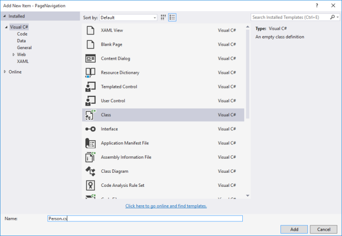
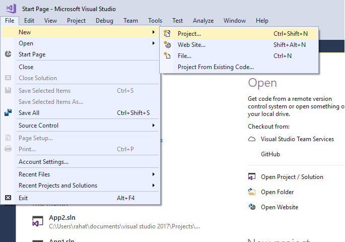
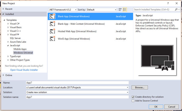
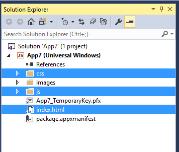
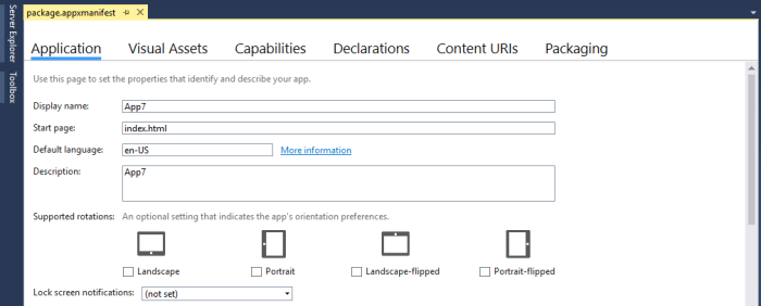
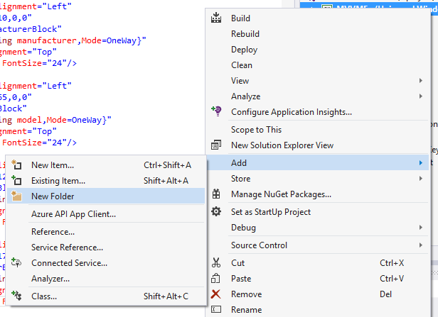
First create a new blank project or you can use your existing Universal Windows Platform Application in this case. First of all, we are going to add a new folder and give it a name ‘Images’. Now, import your Splash Screen image into this folder. The dimension of the image recommended to be 620×300 pixel.

spl1

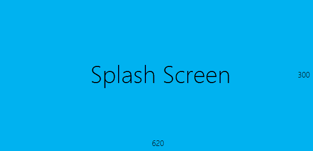
Figure 1: Dimension of Splash Screen.

spl2

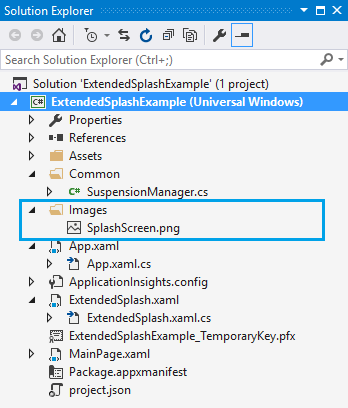
Figure 2: Adding Splash Screen.


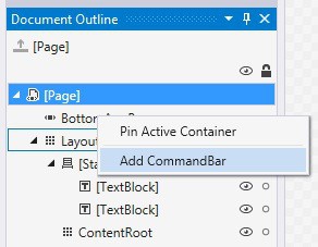
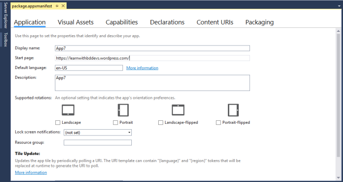
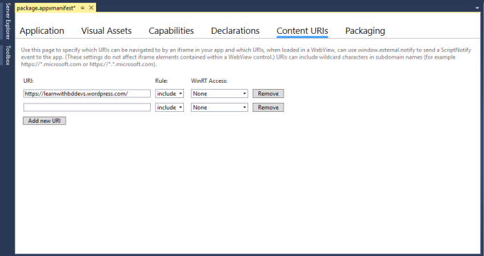
After adding the Splash Screen image, go to the ‘Package.appxmanifest’. Right click on it and slect ‘View Code’.

spl3spl4

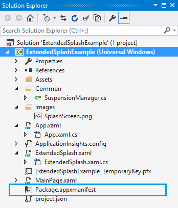
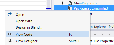
Figure 3: Package.appxmanifest.


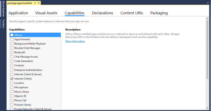
After selecting ‘View Code’, you can see the backend code of the ‘appxmanifest’ file. Change the Splash Screen image URL with the image that you have added in the ‘Images’ folder.

spl5

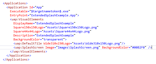
Figure 4: Changing Image URL.


In the above picture, you can see that we have set the BackgroundColor in a specific color code. We have the matched the color with our Splash Screen’s background color and set in the code. You can find the color code simply open the image in Visual Studio.

spl6

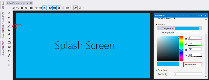
Figure 5: Getting color code.


Select the Dropper tool and click on the Splash Screen background and you can see the actual color code in the Properties menu on the Colors section.

Extended Splash Screen

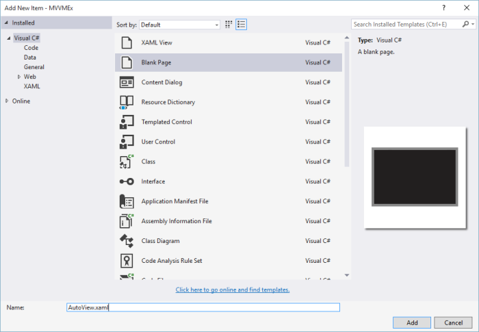
Now, add a new Blank Page, and give a name ‘ExtendedSplash’. Modify the main Grid like the code below.

spl7

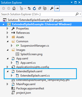
Figure 6: Extended Splash


<Page

mc:Ignorable=”d” Background=”#00B2F0″>


<Grid Background=”#00B2F0″>

<Canvas>

<Image x:Name=”extendedSplashImage” Source=”Images/SplashScreen.png” />

</Canvas>

<ProgressRing Name=”splashProgressRing” IsActive=”True” Height=”30″ Width=”30″  HorizontalAlignment=”Center” VerticalAlignment=”Bottom” Margin=”20″ Foreground=”White”/>

</Grid>

</Page>

Listing: 1


One more thing, you have to do is to add a new helper class, which you can easily find in Official Windows Platform Sample’s Profile. Create a new folder named ‘Common’ and put the .cs file under the folder.

spl8

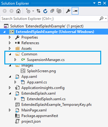
Figure 7: Adding a helper class.


Now come back to the ExtendedSplash.xaml.cs. We have main work to do here. The full source of backend file is given below with description.

public sealed partial class ExtendedSplash : Page

{

internal Rect splashImageRect; // Rect to store splash screen image coordinates.

internal bool dismissed = false; // Variable to track splash screen dismissal status.

internal Frame rootFrame;


private SplashScreen splash; // Variable to hold the splash screen object.

private double ScaleFactor; //Variable to hold the device scale factor (use to determine phone screen resolution)

public ExtendedSplash(SplashScreen splashscreen, bool loadState)

{

InitializeComponent();

DismissExtendedSplash();


// Listen for window resize events to reposition the extended splash screen image accordingly.

// This is important to ensure that the extended splash screen is formatted properly in response to snapping, unsnapping, rotation, etc…

Window.Current.SizeChanged += new WindowSizeChangedEventHandler(ExtendedSplash_OnResize);


ScaleFactor = (double)DisplayInformation.GetForCurrentView().ResolutionScale / 100;


splash = splashscreen;


if (splash != null)

{

// Register an event handler to be executed when the splash screen has been dismissed.

splash.Dismissed += new TypedEventHandler<SplashScreen, Object>(DismissedEventHandler);


// Retrieve the window coordinates of the splash screen image.

splashImageRect = splash.ImageLocation;

PositionImage();

}


// Restore the saved session state if necessary

RestoreStateAsync(loadState);

}


async void RestoreStateAsync(bool loadState)

{

if (loadState)

await SuspensionManager.RestoreAsync();

}


// Position the extended splash screen image in the same location as the system splash screen image.

void PositionImage()

{

extendedSplashImage.SetValue(Canvas.LeftProperty, splashImageRect.Left);

extendedSplashImage.SetValue(Canvas.TopProperty, splashImageRect.Top);

extendedSplashImage.Height = splashImageRect.Height / ScaleFactor;

extendedSplashImage.Width = splashImageRect.Width / ScaleFactor;

}


void ExtendedSplash_OnResize(Object sender, WindowSizeChangedEventArgs e)

{

// Safely update the extended splash screen image coordinates. This function will be fired in response to snapping, unsnapping, rotation, etc…

if (splash != null)

{

// Update the coordinates of the splash screen image.

splashImageRect = splash.ImageLocation;

PositionImage();

}

}


// Include code to be executed when the system has transitioned from the splash screen to the extended splash screen (application’s first view).

void DismissedEventHandler(SplashScreen sender, object e)

{

dismissed = true;

}


async void DismissExtendedSplash()

{

await Task.Delay(TimeSpan.FromSeconds(3)); // set your desired delay

rootFrame = new Frame();

MainPage mainPage = new MainPage();

rootFrame.Content = mainPage;

Window.Current.Content = rootFrame;

rootFrame.Navigate(typeof(MainPage)); // call MainPage

}

}

Listing: 2

Here, we have changed the Constructor, which takes two parameters, one is Splash Screen type and another is a Boolean variable which indicated the loading state of the Splash Screen. There are four major functions, ExtendedSplash_OnResize, PositionImage, RestoreStateAsync and DismissExtendedSplash. ExtendedSplash_OnResize calls the PositionImage method based on the windows size and set the coordinate. PositionImage sets the Canvas property depending on the resulation of the screen, and DismissExtendedSplash sets the time to display the Splash Screen and navigate to the MainPage.


One last thing, we have to do is working with app.xaml.cs file. Open up the file and change the OnLaunched method accordingly.

protected override void OnLaunched(LaunchActivatedEventArgs e)

{

//  Display an extended splash screen if app was not previously running.

if (e.PreviousExecutionState != ApplicationExecutionState.Running)

{

bool loadState = (e.PreviousExecutionState == ApplicationExecutionState.Terminated);

ExtendedSplash extendedSplash = new ExtendedSplash(e.SplashScreen, loadState);

rootFrame.Content = extendedSplash;

Window.Current.Content = rootFrame;

}

//Window.Current.Content = rootFrame;

}

Listing: 3


We have commented out the current content because it prevents to load the main page and load the Splash Screen page instead. Also, change the OnSuspending method like below.

async private void OnSuspending(object sender, SuspendingEventArgs e)

{

var deferral = e.SuspendingOperation.GetDeferral();

await SuspensionManager.SaveAsync();

deferral.Complete();

}

Listing: 4

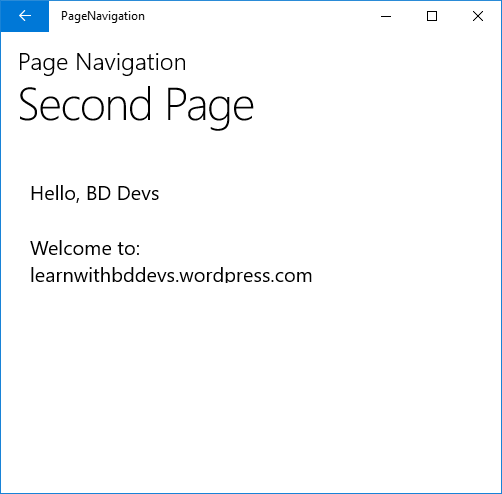
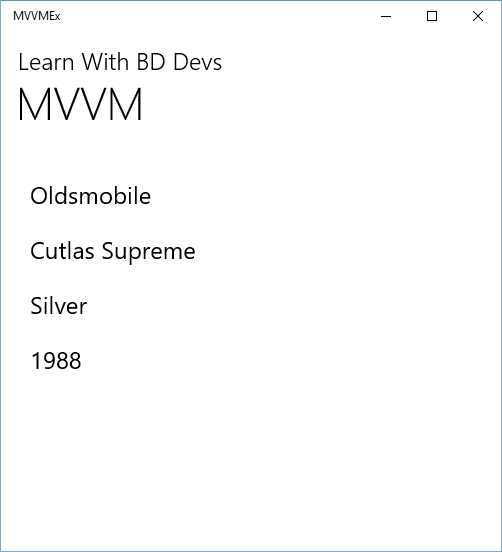
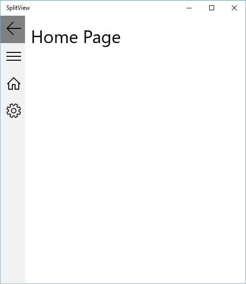
We have set all things needed. Now you good to go. Build the application, and hopefully it builds successfully. Now run the application and it will work like a charm.

spl9

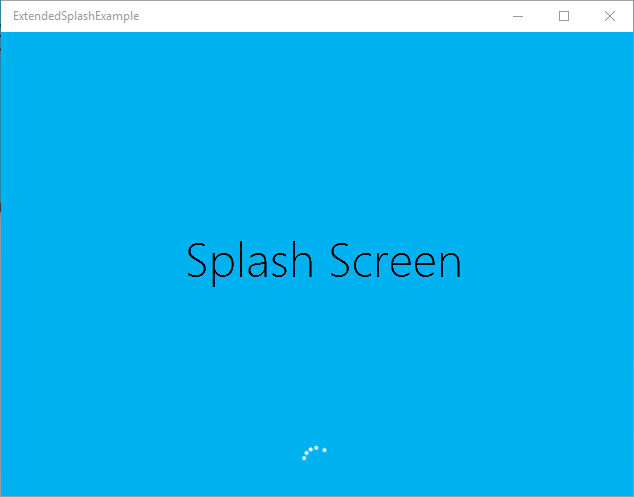
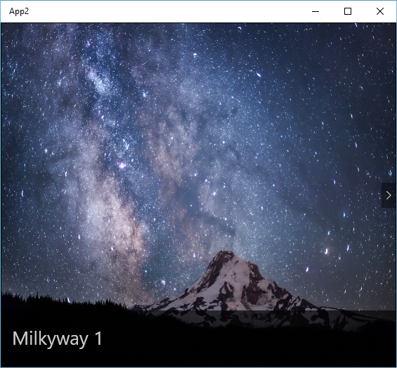
Figure 8: Splash Screen

Universal Windows Platform | Live tiles & Push Notification

Live tiles and push notification are the essential features of Universal Windows Platform Application. These are key features of Modern Application. Also, these show important information without opening the application which runs background. So, it’s really helpful for getting the needed information just looking at the phone to get notified when new messages or updates arrived.

Live tiles

Live tiles usually show some information of the application just glancing at the screen. It updates automatically. In Universal Windows Platform Application, there are four types of tiles available (e.g., small, medium, wide and large).

To implement Live tiles in your application is really an easy task. First create a simple button control.

<<StackPanel>

<Button x:Name=”button” Height=”Auto” Width=”Auto” Content=”Notification Agent” Click=”button_Click” Margin=”10,10,0,0″/>

</StackPanel>

Listing: 1

Then, for Live tiles, we need to create a new instance of SecondaryTile and we want to show the current date-time on that. So, the code behind is given below.

var tileID = “DateTile”;

SecondaryTile tile = new SecondaryTile(tileID, DateTime.Now.ToString(), “args”, new Uri(“ms-appx:///Assets/DefaultSecondaryTileAssests/Medium.png”), TileSize.Default);

tile.VisualElements.Square71x71Logo = new Uri(“ms-appx:///Assets/DefaultSecondaryTileAssests/Small.png”);

tile.VisualElements.Wide310x150Logo = new Uri(“ms-appx:///Assets/DefaultSecondaryTileAssests/Wide.png”);

tile.VisualElements.Square310x310Logo = new Uri(“ms-appx:///Assets/DefaultSecondaryTileAssests/Large.png”);

tile.VisualElements.ShowNameOnSquare150x150Logo = true;

tile.VisualElements.ShowNameOnSquare310x310Logo = true;

tile.VisualElements.ShowNameOnWide310x150Logo = true;

await tile.RequestCreateAsync();

Listing: 2

Here, we’ve create a tileID, which is unique for any tiles. After that, we’ve create a new instance of SeocondaryTile and pass the tileID, current date-time, set the medium tile image for that. Next, we’ve set three different sizes of square logos for that and made their visibility to true. Finally, we’ve set the RequestCreateAsync for the specific tile. Most importantly, the button click method is not async initially, so we’ve to modified it as an async method because the RequestCreateAsync method is an await operation. Now, if you run the application, after click the button, a new window will pop up because we’ve set that in the Secondary tile constructor. Click yes and the tile will appear in your start menu.

Figure: 1

Toast Notification

A Toast Notification is a window element which display some message or information for Universal Windows Platform Application. It will also navigate to the related window of the notified segment. Similar to the Live tiles, just make a button control (see listing 1) or you can use the same code block for this.

The implementation is quite easy. It has mainly three steps, firstly make the template, secondly put the information you want to display, lastly the toast.

var template = ToastTemplateType.ToastText01;

var xml = ToastNotificationManager.GetTemplateContent(template);

xml.DocumentElement.SetAttribute(“launch”, “Args”);

var text = xml.CreateTextNode(DateTime.Now.ToString());

var elements = xml.GetElementsByTagName(“text”);

elements[0].AppendChild(text);


var toast = new ToastNotification(xml);

var notifier = ToastNotificationManager.CreateToastNotifier();

notifier.Show(toast);

Listing: 3

So, we made a single text template and define the template like a XML template. We set the text of today’s date and time and pass the xml template to the toast notification.

If you run the application, it’ll look like this.

Figure: 2

You can also find it in the Action Center.

toast3

Figure: 3

Closure

Hopefully you understand, the procedure and implementation of Live tiles and Toast Notification agent. These are really helpful and make your application more complete and professional. Happy coding!

Download code from here, Link

Universal Windows Platform | Local Storage

Local Storage is really helpful to store small amount of data. If you want to save some settings or something, you can use local storage rather than other storage services. It’s easy to use and flexible of course. So, let’s see how we can use it in our Universal Windows Platform Application.

To start with Local Storage, we will show a really simple example of this. For basic demonstration purpose, in MainPage.xaml we’ve taken two TextBlock wrapped with a StackPanel. First TextBlock will show the application starting date and the second one will show time left of a seven days’ time trial.


<StackPanel>

<TextBlock Name=”textBlock” FontSize=”36″ Height=”50″ Width=”Auto” Margin=”10,10,0,0″ Text=”Starting date.”/>

<TextBlock Name=”textBlock1″ FontSize=”36″ Height=”50″ Width=”Auto” Margin=”10,10,0,0″ Text=”Time left.”/>

</StackPanel>

Listing: 1

Now, in MainPage.xaml.cs define a OnNavigatedTo method and put the relative code inside the block.

protected override async void OnNavigatedTo(NavigationEventArgs e)

{

Windows.Storage.ApplicationDataContainer localSettings = Windows.Storage.ApplicationData.Current.LocalSettings;

if ((string)localSettings.Values[“IsFirstTimeLaunched”] == “true”)

{

textBlock.Text = localSettings.Values[“date”].ToString();

}

else

{

DateTime start = DateTime.Now;

localSettings.Values[“IsFirstTimeLaunched”] = “true”;

localSettings.Values[“date”] = start.Date.ToString();

}

DateTime start1 = DateTime.Parse(localSettings.Values[“date”].ToString());

DateTime end = DateTime.Now;

int trialPeriod = 7;

if ((end.Date – start1.Date).Days <= trialPeriod)

{

textBlock1.Text = “You have ” + (trialPeriod – (end.Date – start1.Date).Days).ToString() + ” left”;

}

}

Listing: 2

First we’ve created ApplicationDataContainerlocalsettings and check a setting “IsFirstTimeLaunched”. If it’s true we show the value otherwise set it “true”, also another setting which is “date”. We set the current date-time to it. So, it will set only once because only the first time the if statement will be false and for the rest of the time it will always true.

Now, we want to set a seven days’ time period, so that we can count the time elapsed from the start. We create a local variable “end” and “trialPeriod”. We check if the difference between start date and end date is less than seven then we display the time left in the second TextBlock.

If you run the application, it will look like this.

Figure: 1

Closure

So, this is a short description of using local storage in you Universal Windows Platform Application. Hope this will help.

Download Code from here, Code Download


Command bar in Universal Windows Platform

CommandBar is another user interface element we can use on the Universal Windows Platform to provide more options in the form of icons and menu options to the user than what they see displayed by default. It is really helpful to implement simple navigation and some feature to your app. So, let’s get crack in Universal Windows Platform Command Bar.


Creating a New Project and Add a CommandBar

First of all, open up a new project or you can simply load your previous project. Now, in your left-side of Visual Studio, you can see a side window named “Document Outline”. Just right click on the “BottomAppBar” and add a “Command Bar”.

cm1

Figure 1


Now, you’ll notice that, it automatically generates a XAML code snippet for you.

<Page.BottomAppBar>

<CommandBar>

<AppBarButton Icon=”Accept” Label=”appbarbutton”/>

<AppBarButton Icon=”Cancel” Label=”appbarbutton”/>

</CommandBar>

</Page.BottomAppBar>

Listing 1

Now, again right click on the “SecondaryCommands” and add a new “AppBarButton”.

cm2

Figure 2


And you can see it creates another menu button for your “Command Bar”, and your XAML code will look like this.

<Page.BottomAppBar>

<CommandBar>

<CommandBar.SecondaryCommands>

<AppBarButton Label=”about”/>

</CommandBar.SecondaryCommands>

<AppBarButton Label=”accept” Icon=”Accept”/>

<AppBarButton Label=”cancel” Icon=”Cancel”/>

</CommandBar>

</Page.BottomAppBar>

Listing 2

We’ve modified the labels of “Accept” and “Cancel” button, it shows the hint about the “Command Bar” buttons, and changed the label of “AppBarButton” to “about”.


Changing the CommandBar Icons

Now, you can change the icons of your “Command Bar”, as you see in the picture below, it already set to “Accept” icon. Because we’ve selected the “accept” button in the XAML code.

cm3

Figure 3


Or you can choose a “font icon” as your Icon, like “A”, “B” or anything you want.

cm4

Figure 4


If you change “Accept” to “A” and “Cancel” to “C”, the code will look like this.

<Page.BottomAppBar>

<CommandBar>

<CommandBar.SecondaryCommands>

<AppBarButton Label=”about”/>

</CommandBar.SecondaryCommands>

<AppBarButton Label=”accept”>

<AppBarButton.Icon>

<FontIcon Glyph=”A”/>

</AppBarButton.Icon>

</AppBarButton>

<AppBarButton Label=”cancel”>

<AppBarButton.Icon>

<FontIcon Glyph=”C”/>

</AppBarButton.Icon>

</AppBarButton>

</CommandBar>

</Page.BottomAppBar>

Listing 3

Changing the CommadBar Mode

You can also change the mode of “Command Bar”. For this, all you’ve to do, is just make some change in your “” tag like the picture below.

cm5

Figure 5


You’ve to select the “Minimal” view of “ClosedDisplayMode”.

<Page.BottomAppBar>

<CommandBar ClosedDisplayMode=”Minimal”>

<CommandBar.SecondaryCommands>

<AppBarButton Label=”about”/>

</CommandBar.SecondaryCommands>

<AppBarButton Label=”accept”>

<AppBarButton.Icon>

<FontIcon Glyph=”A”/>

</AppBarButton.Icon>

</AppBarButton>

<AppBarButton Label=”cancel”>

<AppBarButton.Icon>

<FontIcon Glyph=”C”/>

</AppBarButton.Icon>

</AppBarButton>

</CommandBar>

</Page.BottomAppBar>

Listing 4

Add an Event Handler

Now let’s go back to previous changes and give an event handler in “about” button. To do so, in XAML code select the “About AppBarButton”line and under the “Solution Explorer”, you can see a “Properties” window and select the thunder sign like the picture below,

cm6

Figure 6


and double click on the “Click” section and it automatically generates the code block for you.

cm7

Figure 7


If you take a look at the XAML code, you can see exactly like this.

<Page.BottomAppBar>

<CommandBar ClosedDisplayMode=”Minimal”>

<CommandBar.SecondaryCommands>

<AppBarButton Label=”about” Click=”AppBarButton_Click”/>

</CommandBar.SecondaryCommands>

<AppBarButton Label=”accept” Icon=”Accept”/>

<AppBarButton Label=”cancel” Icon=”Cancel”/>

</CommandBar>

</Page.BottomAppBar>

Listing 5

As, we’ve made an event handler for our “about” button, so we have to take another page named “AboutPage.xaml” and we’ll navigate to that page if someone tap on the “about” button.

So, when you’ve done adding a new page, go to the “MainPage.xaml.cs” or wherever you’ve done this. In our case, we created our “Command Bar” in “MainPage.xaml”, and you can see this code block in that page.

cm8

Figure 8


When’ve done, the code will look like this.

private void AppBarButton_Click(object sender, RoutedEventArgs e)

{

Frame.Navigate(typeof(AboutPage));

}

Listing 6

Running the Application

After all you set, run the application and it will look like this.

cm9

Figure: 9

When you tap on the “about” button, it navigates to the “AboutPage.xaml” page.

cm10

Figure: 10

Passing complex object between classes in UWP

In Universal Windows Platform app, it could have several pages and when we want to navigate through different pages, it opens a new window. But in Universal Windows Platform, there is only one window. When we want to open a different page, it opens a new frame. So things got changed a little like Windows 10.

So, let’s see how it works in Universal Windows Platform page navigation. Let’s get started.


Creating a New Project

Fist open up a new Blank Project. We need another page to navigate from “MainPage” to the second page. So, we need to add a “Blank Page” template and give it a name “SecondPage.xaml”.

obj1

Figure 1

Adding a New Class

Now, we’ve to add another class name “Person.cs”. We’ll create two person’s object “Name” and “Blog” which we’ll pass when we navigate through pages,

obj2

Figure 2

and the code is given below.

class Person

{

public string Name { get; set; }

public string Blog { get; set; }

}

Listing 1

Here, we’ve create to string variable “Name” and “Blog”. Just type “prop” and double tab in the key board, it’ll automatically create full code snippet for you, and tab again and change “int” to “string”, hit tab second time and change “MyProperty” to “Name”. Change the second code snippet like wise.

obj3

Figure 3


Adding a Button Control

Now, we’ll work in “MainPage.xaml”. Take a Button control and change content to “Next Page” and the other property like below.

<Button Content=”Next Page”

HorizontalAlignment=”Left”

Margin=”10,0,0,0″

VerticalAlignment=”Top”

Click=”NextPage_Click”/>

Listing 1

The C# code of “MainPage.xaml.cs”, mainly the event handler of the Button control is given here.

private void NextPage_Click(object sender, RoutedEventArgs e)

{

var person = new Person { Name = “BD Devs”, Blog = “learnwithbddevs.wordpress.com” }

}


Listing 2

Here, we’ve created a person object of our Person class, we’ve set our “Name” and “Blog” and pass it through the “Second Page”. As we mentioned before, Navigation Service do not work in Universal Windows Platform app, it opens up a new frame every time. So, here we call Frame class which has another Navigate Method, which has some types. Like here we’ve “Basic Page” template and we’ve passed our person object as parameter.


Displaying Data in Second Page


Now, in our “SecondPage.xaml” we’ve taken two TextBlock “tb1″ and “tb2″. The XAML code is given below,

<TextBlock x:Name=”tb1″

HorizontalAlignment=”Left”

Margin=”10,10,0,0″

TextWrapping=”Wrap”

VerticalAlignment=”Top”

Height=”50″

Width=”302″

FontSize=”20″/>

<TextBlock x:Name=”tb2″

HorizontalAlignment=”Left”

Margin=”10,65,0,0″

TextWrapping=”Wrap”

VerticalAlignment=”Top”

Height=”50″

Width=”302″

FontSize=”18″/>


Listing 3

and C# code is given here.

protected override void OnNavigatedTo(NavigationEventArgs e)

{

var person = (Person)e.Parameter;


if (!string.IsNullOrWhiteSpace(person.Name))

{

tb1.Text = “Hello, ” + person.Name;

tb2.Text = “Welcome to: ” + person.Blog;

}

else

{

tb1.Text = “Name is required. Go back and enter a name.”;

}

}


Listing 4

We’ve to put all the code in “OnNavigatedTo” method, cause when a new page loads this code block will work to retrieve data while navigate. This method is built in you just need to modify yourself as you like to do.


In our case, we’ve created a person variable object, which we’ve parsed into “Person” class. We’ve checked whether Person’s name is empty or not, if not empty data will be displayed otherwise not. It’ll show an error message “Name is required. Go back and enter a name.”.


Adding Back Button


In Universal Windows Platform app, there is not back button in desktop version. Though, phone app has built in back button, if you press the back button it will bring you directly to the Home of your phone. It is not a good User Experience. To avoid this kind of scenario, you can just modify your app.xaml.cs file a little bit. Open your app.xaml.cs file and put the little code inside the OnLaunched method, below rootFrame.NavigationFailed… event.

rootFrame.NavigationFailed += OnNavigationFailed;

rootFrame.Navigated += OnNavigated;


// OnNavigated Method

private void OnNavigated(object sender, NavigationEventArgs e)

{

// Each time a navigation event occurs, update the Back button’s visibility

SystemNavigationManager.GetForCurrentView().AppViewBackButtonVisibility =

((Frame)sender).CanGoBack ?

AppViewBackButtonVisibility.Visible :

AppViewBackButtonVisibility.Collapsed;

}


Listing: 5

Moreover, you need to implement a Back Key Request event. To do that, put the code in OnLauched method, below the Window.Current.Content… event.

Window.Current.Content = rootFrame;


SystemNavigationManager.GetForCurrentView().BackRequested += OnBackRequested;


SystemNavigationManager.GetForCurrentView().AppViewBackButtonVisibility =

rootFrame.CanGoBack ?

AppViewBackButtonVisibility.Visible :

AppViewBackButtonVisibility.Collapsed;


// OnBackRequested Method

private void OnBackRequested(object sender, BackRequestedEventArgs e)

{

Frame rootFrame = Window.Current.Content as Frame;


if (rootFrame.CanGoBack)

{

e.Handled = true;

rootFrame.GoBack();

}

}


Listing: 6

Note: Place the OnNavigated&OnBackRequested method outside the OnLaunched method.

All of our work is done. If you run the application, it’ll look like this.

Desktop Application

obj4

obj5

Figure: 7

Hit the “Next Page” Button and it’ll navigate to the “Second Page”, and display the “Name” and “Blog” info on the TextBlocks respectively.

Article on Universal Windows Platform | Data Binding

Databinding is useful technique to populate data into your application. It’s really useful when you’ve massively structured code, and you’ve to handle a lots of data. It binds your whole bunch of data into a single control, like ListView, ListBox, FlipView or it can be your custom control. XAML gives us the power to bind the data into these structural controls with less effort and in an efficient way.


So let’s get started with Universal Windows Platform app development with a simple databinding technique.


Different Binding Modes

There are a number of different binding modes, as defined in the BindingMode enumeration:

TwoWay – changes to the UI or model automatically update the other. This is used for editable forms or other interactive scenarios.

OneWay – updates the UI when the model changes. This is appropriate for read-only controls populated from data.

OneTime – updates the UI when the application starts or when the data context changes. This is used when the source data is static/does not change.

OneWayToSource – changes to the UI update the model

Default – uses the default mode for the particular binding target (UI control). This differs based on the control.


In Universal Windows Platform, introduces a new kind of binding is Compile Binding (x:Bind). Comparing traditional binding techniques, it is really efficient and also faster. If you have less amount of data, may be you won’t notice the actual change of execution time but when you’re working on vast amount of data, you will notice the actual differences. To start with our project, first create a new blank application. Then, create a new folder and give it a name “Images”. I have used Images from Microsoft theme download site. Now, add these images into this folder.

dtb1

Figure 1

Designing UI

To design the UI element, we’ve used FlipView control. Because we want to show the images by using databinding technique. Paste the code into your main grid element.

<FlipView Name=”MyFlipView” BorderBrush=”Black” BorderThickness=”1″ ItemsSource=”{x:Bind Items}” xmlns:m=”using:App2″>

<FlipView.ItemTemplate>

<DataTemplate x:DataType=”m:Images”>

<Grid>

<Image Source=”{x:Bind images}” Stretch=”Fill” />

<Border Background=”#A5000000″ Height=”80″ VerticalAlignment=”Bottom” >

<TextBlock Text=”{x:Bind title}” FontFamily=”Segoe UI” FontSize=”26.667″ Foreground=”#CCFFFFFF” Padding=”15,20″ />

</Border>

</Grid>

</DataTemplate>

</FlipView.ItemTemplate>

</FlipView>

Listing: 1

Here, the name of the FlipView control is “MyFlipView” and there are two main child element: Image and TextBox. TextBox control is wrapped by a Border control which give a little bit of effect in the UI.


Most importantly, if you notice we’ve bind the ItemSource by compile binding and that’s why we’ve to define DataType (m:Images) by its class name. Here Images is the name of the class which contains an image and sting attribute.

public class Images

{

public BitmapImage images { get; set; }

public string title { get; set; }

}

Listing: 2

Lastly, we bind the Image and TextBox with “images” and “title”. The backend code will be like this.


public ObservableCollection<Images> Items { get; private set; } = new ObservableCollection<Images>();

BitmapImage[] bitmapImage = new BitmapImage[9];

bitmapImage[0] = new BitmapImage(new Uri(“ms-appx:///Images/milkyway1.jpg”, UriKind.RelativeOrAbsolute));

bitmapImage[1] = new BitmapImage(new Uri(“ms-appx:///Images/milkyway2.jpg”, UriKind.RelativeOrAbsolute));

bitmapImage[2] = new BitmapImage(new Uri(“ms-appx:///Images/milkyway3.jpg”, UriKind.RelativeOrAbsolute));

bitmapImage[3] = new BitmapImage(new Uri(“ms-appx:///Images/milkyway4.jpg”, UriKind.RelativeOrAbsolute));

bitmapImage[4] = new BitmapImage(new Uri(“ms-appx:///Images/milkyway5.jpg”, UriKind.RelativeOrAbsolute));

bitmapImage[5] = new BitmapImage(new Uri(“ms-appx:///Images/milkyway6.jpg”, UriKind.RelativeOrAbsolute));

bitmapImage[6] = new BitmapImage(new Uri(“ms-appx:///Images/milkyway7.jpg”, UriKind.RelativeOrAbsolute));

bitmapImage[7] = new BitmapImage(new Uri(“ms-appx:///Images/milkyway8.jpg”, UriKind.RelativeOrAbsolute));

bitmapImage[8] = new BitmapImage(new Uri(“ms-appx:///Images/milkyway9.jpg”, UriKind.RelativeOrAbsolute));


string[] title = new string[] { “Milkyway 1”, “Milkyway 2”, “Milkyway 3”, “Milkyway 4”, “Milkyway 5”, “Milkyway 6”, “Milkyway 7”, “Milkyway 8”, “Milkyway 9” };


for (int i = 0; i < 9; i++)

{

this.Items.Add(new Images { images = bitmapImage[i], title = title[i] });

}


MyFlipView.ItemsSource = Items;

Listing: 3

Here, we declare a list item named “Items” and assign it to “MyFlipView” control. We’ve added the image and title array to the collection list by using a for loop.

If we run the application, it will look like this.

dtb2

Figure 2

Another way to bind is traditional way that’s we’re doing before in Windows 10 and later. We’ve change a little bit to our XAML code.

<FlipView Name=”MyFlipView” BorderBrush=”Black” BorderThickness=”1″ ItemsSource=”{Binding Items}”>

<FlipView.ItemTemplate>

<DataTemplate>

<Grid>

<Image Source=”{Binding images}” Stretch=”UniformToFill” />

<Border Background=”#A5000000″ Height=”80″ VerticalAlignment=”Bottom” >

<TextBlock Text=”{Binding title}” FontFamily=”Segoe UI” FontSize=”26.667″ Foreground=”#CCFFFFFF” Padding=”15,20″ />

</Border>

</Grid>

</DataTemplate>

</FlipView.ItemTemplate>

</FlipView>

Listing: 4

If we compare two binding techniques, we can see that compile binding is much faster than normal binding.

dtb3

Figure 3: Compile Binding


Here the memory process is 60 bytes. If you look at the normal binding, the memory process is 70 bytes.

dtb4

Figure 4: Normal Binding

Convert your Web Application into UWP App


In this tutorial we will convert a web application into a universal windows platform app using new visual studio 2017 in just few minutes.

It is recommended to develop hosted web apps of your websites only. If you are not the owner of the site, then you do not have any right to convert that web application to a universal windows platform app.

In this tutorial I will use my blog site to convert it in a universal windows platform app in few steps.

0011

Figure 1: My blog site

Now lets create new project in visual studio 2017. Click on File then, New Project.

0

Figure 2: Create new project

Now select Blank APP (Universal Windows) in Windows Universal section of JavaScript template. This is a project for a Universal Windows App that has no predefined controls or layout and it has direct access to all Universal Windows APIs.

1

Figure 3: Project template selection

Now you need to select target and minimum platform version of your universal windows application.

Here I have selected Windows 10 Anniversary Edition as target version and Windows 10 as minimum version.

2

Figure 4: Target version selection

Now from the solution explorer you can see that the project files are ready. There are CSS folder, images, js, index page and few other files. As you are not going to use any local resource and load web page in your application, so you don’t need css folder, js folder and index.html page.

3

Figure 5: Solution Explorer

As we are not using any local resources, so we have just deleted css folder, js folder and index.html.

4

Figure 6: Solution explorer after deleting files.

Now open package.appmanifest file. Here you can see that index.html is listed as start page of the application. You will use your own website link here.

5

Figure 7: Package.AppManifest page

Here, I have replaced my web application address with index.html page as the starting page of my universal windows platform app.

6

Figure 8: package.appmanifest page after modification

Now go to Capabilities tab to check whether Internet(client) capability is checked or not. Usually it is checked as default.

7

Figure 9: Capabilities tab of package.appmanifest page

Now open Content URIs tab. We will use this page to specify which URIs can be navigated to by an iframe in our app and which URIs, when loaded in a WebView, can use window.external.notify to send a ScriptNotify event to the app. Will use my blog site address as the URI and select include as Rule and None as WinRT Access.

8

Figure 10: Content URIs tab

Now will run the app. It will take few second to build and run it. We are running the app using local machine option. Once it run, we will see our Hosted universal windows platform app. We can launch this app in windows marketplace as well.

9

Figure 11: Hosted Universal Windows Platform app

Model View View Model in Universal Windows Platform

“MVVM” stands for “Model-View-ViewModel”. Model basically initialize properties, attributes whatever you say, and “ViewModel” contains all data of your application. Finally View represents actual representation of data in your screen. Basically Data Binding works between “ViewModel” and “View “layer, “View” requests command and “ViewModel” accept it and responses to the “View”. I’m not going the whole theoretical knowledge. I tried to give you the basic idea what “MVVM” is.

Now, let’s get crack in the best practice in this super awesome architectural model.

Creating a New Project

First of all, open up a new project and name it “MVVMEx” or whatever you want. Now, add three folders “Models”, “ViewModels” and “Views” one by one, like this.

mvvm1

Figure 1

It should look exactly like below in Figure 2.

mvvm2

Figure 2

Adding a New Page

Now, in “Views” folder right click and add a new “Blank Page”, give it a name “AutoView”.

mvvm3

Changing the Starting Page

Now one more thing we’ve to do, is changing our starting page. For that, you’ve to go “app.xaml.cs” and change this line of code,

if (rootFrame.Content == null)

{

// When the navigation stack isn’t restored navigate to the first page,

// configuring the new page by passing required information as a navigation

// parameter

rootFrame.Navigate(typeof(Views.AutoView), e.Arguments);

}

Listing: 1

because, we’ve replaced our “MainPage.xaml” and add a new page “AutoView.xaml”.

Adding Classes

Now, similarly right click on the “Model” folder and add a new class named “Auto.cs”. Again right click on the “ViewModels” folder and add another class named “AutoViewModel.cs”. After all you setup, your Solution Explorer will look like in Figure 4.

mvvm4

Figure 4

Now we’ll modify our “AutoView.xaml” as follows.

Modifying “AutoView.xaml” Page

Setting up app title and information.

<!– Title Panel –>

<StackPanel Grid.Row=”0″ Margin=”19,0,0,0″>

<TextBlock Text=”Learn With BD Devs” Style=”{ThemeResource TitleTextBlockStyle}” Margin=”0,12,0,0″/>

<TextBlock Text=”MVVM” Margin=”0,-6.5,0,26.5″ Style=”{ThemeResource HeaderTextBlockStyle}” CharacterSpacing=”{ThemeResource PivotHeaderItemCharacterSpacing}”/>

</StackPanel>

Listing 2

Modifying main grid.

<!–TODO: Content should be placed within the following grid–>

<Grid Grid.Row=”1″ x:Name=”ContentRoot” Margin=”19,9.5,19,0″>

<TextBlock Height=”50″

HorizontalAlignment=”Left”

Margin=”10,10,0,0″

Name=”manufacturerBlock”

Text=”{Binding manufacturer,Mode=OneWay}”

VerticalAlignment=”Top”

Width=”342″ FontSize=”24″/>

<TextBlock Height=”50″

HorizontalAlignment=”Left”

Margin=”10,65,0,0″

Name=”modelBlock”

Text=”{Binding model,Mode=OneWay}”

VerticalAlignment=”Top”

Width=”342″ FontSize=”24″/>

<TextBlock Height=”50″

HorizontalAlignment=”Left”

Margin=”10,120,0,0″

Name=”colorBlock”

Text=”{Binding color,Mode=OneWay}”

VerticalAlignment=”Top”

Width=”342″ FontSize=”24″/>

<TextBlock Height=”50″

HorizontalAlignment=”Left”

Margin=”10,175,0,0″

x:Name=”yearBlock”

Text=”{Binding year, Mode=OneWay}”

VerticalAlignment=”Top”

Width=”342″ FontSize=”24″/>

</Grid>

Listing 3

Implementation of “BaseModel.cs” Class

Now, we’ll move to our “Models” folder and initialize auto’s properties, but before that, we’ve to add another class name “BaseModel.cs” in our “Common” folder.

public class BaseModel : INotifyPropertyChanged

{

public event PropertyChangedEventHandler PropertyChanged;

protected bool SetProperty<T>(ref T storage, T value, [CallerMemberName] string propertyName = null)

{

if (object.Equals(storage, value)) return false;

storage = value;

this.OnPropertyChaned(propertyName);

return true;

}

private void OnPropertyChaned(string propertyName)

{

var eventHandler = this.PropertyChanged;

if (eventHandler != null)

eventHandler(this, new PropertyChangedEventArgs(propertyName));

}

}

Listing 4

It’s our “INotifyPropertyChanged” interface. As, we’ve said in best practice, you’ve make your code as much clean you can.


Implementation of “Auto.cs” Class

Now, move back to our “Auto.cs” class. The initialized properties are given below.

public class Auto : BaseModel

{

private string _manufacturer;

private string _model;

private string _color;

private int _year;

public string manufacturer

{

get { return _manufacturer; }

set { this.SetProperty(ref this._manufacturer, value); }

}

public string model

{

get { return _model; }

set { this.SetProperty(ref this._model, value); }

}

public string color

{

get { return _color; }

set { this.SetProperty(ref this._color, value); }

}

public int year

{

get { return _year; }

set { this.SetProperty(ref this._year, value); }

}

}

Listing 5

Here, we’ve inherited all the public properties of “BaseModel.cs” class, and fire the value of data in setter. Just simple logic of OOP (Object Oriented Programming).

Setting Up Data in “AutoViewModel.cs” Class

Now, we’ll set the data of our “Auto” properties in “AutoViewModel.cs” class.

public class AutoViewModel : Auto

{

Auto _auto = new Auto

{

manufacturer = “Oldsmobile”,

model = “Cutlas Supreme”,

color = “Silver”,

year = 1988

};

public AutoViewModel()

{

this.manufacturer = _auto.manufacturer;

this.model = _auto.model;

this.color = _auto.color;

this.year = _auto.year;

}

}

Listing 6

Here, we’ve used Inheritance and inherited “Auto.cs” class like before, so that we can access all the public properties of “Auto.cs” class.

We created a “_auto” object of “Auto.cs” class and initialize all the values here, and in constructor “AutoViewModel” we make references of these properties.


Setting Up DataContext in “AutoView.xaml.cs” Class

It’s almost done our work. Now, to visualize the data of our “AutoViewModel.cs” class, we have to instantiate in our “AutoView.xaml.cs” class. To do so, change these line of code as follows.

private AutoViewModel defaultViewModel = new AutoViewModel();

public AutoView()

{

this.InitializeComponent();

this.DataContext = defaultViewModel;

}

public AutoViewModel DefaultViewModel

{

get { return this.defaultViewModel; }

}

Listing 7

Here, we’ve create a “defaultViewModel” object of “AutoViewModel.cs” class and make it the “DataContext” of our “AutoView.xaml.cs” class in constructor. It actually retrieves all data fromm “AutoViewModel” constructor and shows in “ContentRoot” grid of “AutoView.xaml”.


Running the Application

Now, it’s time to build our project. After you run the application, it should look exactly like this.

mvvm5

Figure: 5

Universal Windows Platform | Http Client

Now a day Web API is the most commonly used cloud service for any types of application. It’s flexible and easy to use. It works like normal http get and post method and other advanced functionality. In this article, we’ll talk about how we can retrieve data and send data to the server via Azure Mobile Service API using HttpClient NuGet package. So, let’s get crack in HttpClient in Universal Windows Platform Application.

To make the API we’ve to go to Azure Mobile Service option. If you’ve followed my last article, that described how to create an Azure Mobile Service. Now, open your Mobile Service and navigate to the API tab.

http1

Figure: 1

Now, open the Mobile Service, here we’ve it named ‘traffic’, and go to the permission tab. Make the GET & POST permission to Everyone., save it.

http2

Figure: 2

Now move to the Script tab, and past the following JavaScript code. Your code may vary due to the Table structure of your Mobile Service.

http3

Figure: 3

Here, in GET method, we make a simple SQL query and send to the client who will request it and in POST method we’ve just send the response message ‘Hello world’, if the request made successful.

Now, create a new class and give it a name Item and initialize two property Message and Location.

class Item

{

[JsonProperty(PropertyName = “message”)]

public string Message { get; set; }

[JsonProperty(PropertyName = “location”)]

public string Location { get; set; }

}

Listing: 1

In MainPage.xaml, the design is same as the previous article. We’ve create a simple ListBox control and bind with the Table’s attribute.

<ScrollViewer>

<StackPanel Margin=”10,10,0,0″>

<ListBox x:Name=”listBox”

Margin=”10,10″

RequestedTheme=”Dark”

FontSize=”20″

Background=”White”

Foreground=”Black” BorderThickness=”1″

BorderBrush=”Transparent” >

<ListBox.ItemContainerStyle>

<Style TargetType=”ListBoxItem”>

<Setter Property=”HorizontalContentAlignment” Value=”Stretch”></Setter>

</Style>

</ListBox.ItemContainerStyle>

<ListBox.ItemTemplate>

<DataTemplate>

<Border BorderThickness=”0,0,0,1″ BorderBrush=”#c0c0c0″>

<StackPanel>

<TextBlock Foreground=”Black” Text=”{Binding Message}” />

<TextBlock Foreground=”Black” Text=”{Binding Location}” />

</StackPanel>

</Border>

</DataTemplate>

</ListBox.ItemTemplate>

</ListBox>

</StackPanel>

</ScrollViewer>

Listing: 2

Now in code behind, MainPage.xaml.cs file create a List item named _itemsList of Class Item type, and in Constructor generate a Method stub MainPage_Loaded. All the implementation is given below.

private List<Item> _itemsList = new List<Item>();


public MainPage()

{

this.InitializeComponent();

this.Loaded += MainPage_Loaded;

}

async void MainPage_Loaded(object sender, RoutedEventArgs e)

{

try

{

String uri = “_YOUR API URL GOES HERE_”;

JArray items = await GetAsync(uri);

int i = 0;

int length = items.Count;

Debug.WriteLine(length);

while (i < length)

{

_itemsList.Add(new Item { Message = items[i][“message”].ToString(), Location = items[i][“location”].ToString() });

Debug.WriteLine(items[i][“message”].ToString() + ” ” + items[i][“location”].ToString()); // For testing purpose.

i++;

}

this.listBox.ItemsSource = _itemsList;

Item item = new Item

{

Message = “”,

Location = “”

};

string jsonData = JsonConvert.SerializeObject(item);

JObject message = await PostAsync(uri, jsonData);

Debug.WriteLine(message); // For testing purpose.

}

catch (Exception ex)

{

Debug.WriteLine(ex.Message);

}

}

Listing: 3

Here, first we need the API Uri, then Json Array (JArray) and get it from the given Uri. Then we get the length of the Json array and loop while it becomes zero. Inside the loop we insert the items in to the List we’ve created before and then make it the ItemSource of the ListBox.


Then we’ve created a new instance of Item class and declare two null values for POST operation. After that, we send the data to server by serializing it as a Json format. The GetAsynce and PostAsynce methods are given below.

private async Task<JArray> GetAsync(string uri)

{

var httpClient = new HttpClient();

var content = await httpClient.GetStringAsync(uri);

return await Task.Run(() => JArray.Parse(content));

}

public async Task<JObject> PostAsync(string uri, string data)

{

var httpClient = new HttpClient();

var response = await httpClient.PostAsync(uri, new StringContent(data));

response.EnsureSuccessStatusCode();

string content = await response.Content.ReadAsStringAsync();

return await Task.Run(() => JObject.Parse(content));

}

Listing: 4

These are the simple implementation of the two methods.  The GetAsynce will return the Json Array from the Uri and the PostAsynce will return the success message if the data transfer done successfully. It will check if there is any error by response.EnsureSuccessStatusCode() method.

If we run the Application, it will give the same result but an attribute less than the previous article.

Figure : 4

To test your API Uri, you can use Postman Google Chrome App. This is a good way to test the Uri working or not.

http6

Figure: 5

You can view the data in different format also test the Uri by GET, POST and many other http methods.

If you want to see the POST is successful or not, you can see the Output windows. If you see the success message that you’ve sent from server, then you good to go.

http7

Figure: 6

This is the same message in Figure 3 which we’ve set in line number 6.

This article is a demonstrate purpose, how you can use the Web API in your Universal Windows Platform Application. Hope this will help to understand the ins and outs of HttpClient Nuget package and handling Json data. Happy coding!

List Box Control in Universal Windows Platform

One of the common also important controls of Windows 10 Universal App is List Box control. It is really helpful for making a long list of elements. You can populate it with some data, pictures or anything that you want to show in your application. List Box, can be implemented easily only by XAML. In this example, we are going to use our previous project SplitView control and make the Split View Pane items with the help of List Box. So, let’s get started.


Creating a Project with Split View Control

First of all, create a new project and in MainPage.xaml inside the Grid make a new SplitView control.


<SplitView x:Name=”SplitView” OpenPaneLength=”200″ CompactPaneLength=”50″

DisplayMode=”CompactOverlay” IsPaneOpen=”False” PaneBackground=”DarkGray” >

<SplitView.Pane>

<!–Pane Items–>

</SplitView.Pane>

<SplitView.Content>

<!–Content View–>

</SplitView.Content>

</SplitView>

Listing: 1

Previously, we have created the Pane items with Radio Buttons with custom styles. But, now we will work with ListBox items, and the work will be much easier for us.


Creating ListBox Items

ListBox is very simple control with inline elements of ListBox items. The basic structure of ListBox is given below.

<ListBox>

<ListBoxItem Content=”First” />

<ListBoxItem Content=”Second” />

<ListBoxItem Content=”Third” />

</ListBox>

Listing: 2

We can declare as many items inside the ListBox control. Now, replace the commented Pane Items with the code below.

<ListBox SelectionMode=”Single”

SelectionChanged=”ListBox_SelectionChanged”>

<ListBoxItem Name=”Back” Background=”Gray”>

<StackPanel Orientation=”Horizontal”>

<TextBlock FontFamily=”Segoe MDL2 Assets” FontSize=”30″ Text=”” />

<TextBlock FontSize=”24″ Margin=”10,0,0,0″>Back</TextBlock>

</StackPanel>

</ListBoxItem>

<ListBoxItem Name=”Hamburger”>

<StackPanel Orientation=”Horizontal”>

<TextBlock FontFamily=”Segoe MDL2 Assets” FontSize=”30″ Text=”” />

<TextBlock FontSize=”24″ Margin=”10,0,0,0″>Menu</TextBlock>

</StackPanel>

</ListBoxItem>

<ListBoxItem Name=”Home”>

<StackPanel Orientation=”Horizontal”>

<TextBlock FontFamily=”Segoe MDL2 Assets” FontSize=”30″ Text=”” />

<TextBlock FontSize=”24″ Margin=”10,0,0,0″>Home</TextBlock>

</StackPanel>

</ListBoxItem>

<ListBoxItem Name=”Settings”>

<StackPanel Orientation=”Horizontal”>

<TextBlock FontFamily=”Segoe MDL2 Assets” FontSize=”30″ Text=”” />

<TextBlock FontSize=”24″ Margin=”10,0,0,0″>Settings</TextBlock>

</StackPanel>

</ListBoxItem>

</ListBox>

Listing: 3

Here we taken a ListBox, and there are four List Box items like previously we had four Radio Buttons. Each item represents correspondent SplitViw Pane item. Inside the ListBoxItem, there a StackPanel to hold the icon and the text of the items. StackPanel arranges the TextBlocks in a same alignment. In first TextBlock, Font Family is Sagoe MDL2 Assets, which is the same as Character Map special character set, and Text is just the following character.

ls1

Figure: 1


Adding Extra Pages

Now, create two blank pages named Page1.xaml and Page2.xaml. In Page1.xaml, change the code like below.

<Grid Background=”{ThemeResource ApplicationPageBackgroundThemeBrush}”>

<TextBlock FontSize=”36″ Text=”Home Page” Margin=”12,17,0,17″/>

</Grid>

Listing: 4

Similarly, in Page2.xaml change the code like below.

<Grid Background=”{ThemeResource ApplicationPageBackgroundThemeBrush}”>

<TextBlock FontSize=”36″ Text=”Settings Page” Margin=”12,17,0,17″/>

</Grid>

Listing: 5

Handle events in code-behind MainPage.xaml.cs

The event handlers of the Split View’s Radio Buttons are as follows.

private void ListBox_SelectionChanged(object sender, SelectionChangedEventArgs e)

{

if (Back.IsSelected)

{

if (MyFrame.CanGoBack)

{

MyFrame.GoBack();

}

}

else if (Hamburger.IsSelected)

{

if (!this.SplitView.IsPaneOpen)

{

this.SplitView.IsPaneOpen = true;

}

else

{

this.SplitView.IsPaneOpen = false;

}

}

else if (Home.IsSelected)

{

MyFrame.Navigate(typeof(Page1));

}

else if (Settings.IsSelected)

{

MyFrame.Navigate(typeof(Page2));

}

else

{

// do nothing

}

}

Listing: 6

If you notice, we do not have any extra Button control here, and it is just the SelectionChanged event of the ListBox control. Every ListBoxItem has a unique name, so we check whether it is selected or not. If so, we have make the frame navigate to other correspondent page. You can also see the previous article at http://bit.ly/1O626HP.


Running the Application

If you run the application, it will look like this.

ls2

Figure: 2


Conclusion

ListBox is a common and useful control. You can use it for static data as well as some other data source. Hope this helps you to understand the basic implementation of ListBox in Universal Windows Application. Happy Coding!