Windows Phone 8.1 Complete Solution eBook on C# Corner

We are really happy to announce that last week we published our first eBook “Windows Phone 8.1 Complete Solution” in technical site C# Corner.

Download Link: http://www.c-sharpcorner.com/ebooks/free/100/windows-phone-8-1-complete-solution.aspx

Summary:
This book is written for the beginners who are thinking to start developing Windows Phone Application and it would be a gentle introduction of learning Windows Phone App developing to others.
Intoduction:
Windows Phone 8.1 Complete Solution is the first complete book on windows phone 8.1. Authors of this book is Rahat Yasir and Shariful Islam Nibir. Both of this authors are experienced windows phone app developers and have 3 + years of experience in this field.

Table of Contents

Introduction
IDE installation
Hello World
WP Control Part 1
WP Control Part 2
WP Control Part 3
XAML Styling
Appxmanifest
Splash Screen
Page Navigation
Working with Emulator
Command Bar
Data Binding
MVVM
HUB App with json Data
MAP
Phonegap Part 1
Phonegap Part 2
APP Studio
Submitting App in Windows Phone Store
Appendix

wp8.1

Windows Phone – Extended Splash Screen with Progress Bar

Welcome again! In my previous article I’ve talked about Windows Phone “Package.appxmanifest”. I’ve shown there, how to add custom application logos with different resolution. It makes your app much beautiful and attractive.

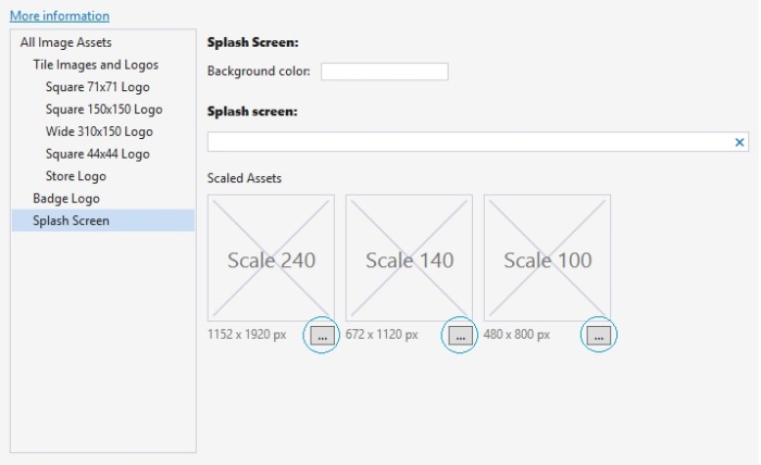
One more thing to add in your application is “Splash Screen”. This gives you a nice representation of your app and yourself or your company. So, how you can do that? It’s really simple to add a “Splash Screen” in Windows Phone 8.1 with Visual Studio 2013 update 3. Just go to “Package.appxmanifest” and open “Visual Assets” tab. Then you can find “Splash Screen” at the bottom.

1

All you have to do, is just upload your “Splash Screen” in your project and locate this file. This will brings the “Splash Screen” when someone open the application, but it’ll vanish in blink of an eye. To make effective, we need to add “Splash Screen” in a different way. We call it “Extended Splash Screen”.

So let’s get crack in Windows Phone “Extended Splash Screen with Progress Bar”. First of all, take “Blank App” template, give it a name “ExtendedSplash.xaml” and customize your main grid like this.

<Grid>
	<Image x:Name="extendedSplashImage" Source="Images/SplashScreen.png" Stretch="Fill"/>
	<Canvas>
		<ProgressBar IsIndeterminate="True" Maximum="100" Value="30" Height="10" Width="400"/>
	</Canvas>
</Grid>

Here, we’ve also taken a “ProgressBar” control to indicate that the application is running while displaying the “Splash Screen”. It makes the application really cool.Now in “ExtendedSplash.xaml.cs” put this method below and call it from the constructor, like this.

public ExtendedSplash()
{
	this.InitializeComponent();

	//Call MainPage from ExtendedSplashScreen after some delay
	ExtendeSplashScreen();
}

async void ExtendeSplashScreen()
{
	await Task.Delay(TimeSpan.FromSeconds(3)); // set your desired delay
	Frame.Navigate(typeof(MainPage)); // call MainPage
}

Here we’ve ue an async method named “ExtendeSplashScreen” and make it delayed till three seconds. Then it’ll bring the “MainPage.xaml”.

One more thing to do, is make the start up page to “ExtendedSplash.xaml” otherwise the splach screen will not work. To do so, go to “App.xaml.cs” and find “OnLaunched” method, and at the bottom you’ll find “rootFrame.Navigate(typeof(MainPage), e.Arguments)”, change “MainPage” to “ExtendedSplash” which we’ve named to our “Splash Screen”.

if (!rootFrame.Navigate(typeof(ExtendedSplash), e.Arguments))
{
	throw new Exception("Failed to create initial page");
}

Now, we’ve set all things to make work our “Splash Screen”. But it’s really important to understand the Windows Phone page navigation service. We’ve set the starting page to our “Splash Screen” and after three seconds it’ll bring the “Main Page”. But when we want to go back, it’ll bring the “Splash Screen” again and after three seconds it’ll bring the “Main Page” again. So it’s just irritating. To avoid this problem we need to add a method called “HardwareButtons_BackPressed” in “MainPage.xaml.cs”

void HardwareButtons_BackPressed(object sender, Windows.Phone.UI.Input.BackPressedEventArgs e)
{
	Frame frame = Window.Current.Content as Frame;
	if (frame == null)
	{
		return;
	}

	if (frame.CanGoBack)
	{
		frame.GoBack();
		//Indicate the back button press is handled so the app does not exit
		e.Handled = true;
	}
}

Here, we make Frame object name “frame” and if it’s not null and if we’ve a go back state, then we make “e.Handled” equal to true, so that app doesn’t exit. If you make it false, the app will exit when you press the back button. Another problem is, if you have multiple of pages then it will bring the “Splash Screen” instead of bringing the previous page because of calling the method “GoBack”. We need this for another purpose which I’m talking later.

Now, we’re handling the “Can go back” task, but our problem still exists. To solve this problem we need to check the “Back State” situation. If the “Back State” equals to one, then we’ve only one page remaining and it’s obviously our “Splash Screen”. So, we just need to remove the “Back State” so that our app can exit. To do so, just put this code inside the “OnNavigatedTo” method.

// Check if ExtendedSplashscreen.xaml is on the backstack  and remove 
if (Frame.BackStack.Count() == 1)
{
	Frame.BackStack.RemoveAt(Frame.BackStackDepth - 1);
}

Now, back to unfinished topic is why we need to use “frame.Goback” method, becauese if we don’t use it we’ll get an exception when we’ll navigate through multiple pages and press back key. To avoid that, we need this method. Now, run the application and it’ll work just fine.

m

If you look closely, you can see “Progress Bar” top of the “Splash Screen” and it’ll be displaying for three seconds, then the “MainPage” will come.

So, that’s it. Hope you’ve understand all these things. I’ll be here with a new topic soon. Till then good bye. Have a nice day. Happy coding.

You can download the full souce code from here,
Download link: http://1drv.ms/1FbBeBy

Windows Phone XAML Styling

Welcome again! Today I’ll talk about XAML styling. How you can make your XAML controls more beautiful and customized. If you search “windows phone xaml style” you’ll get some helpful references. Styling XAML is not only for customizing your controls but also make code much clean and easily readable. So let’s get crack in Windows Phone XAML Styling.

I’ll just try to explain how you can use XAML styling in you existent projects. I’m just going to modify my existing user control to show you the procedure. If you’ve read my Windows Phone Controls – Part 1 article, then you can understand the difference between previous and current XAML code. I’ll not modify all the controls, but the “Popup Window”. I’ve used a “User Control”, I’ll just modify that page.

First of take a new Project and add a new “User Control”. We’ve used these XAML code in our previous Project.

<Grid>
    <Border BorderBrush="{StaticResource ApplicationForegroundThemeBrush}" BorderThickness="1" Background="{StaticResource ApplicationPageBackgroundThemeBrush}">
        <Border BorderBrush="{StaticResource ApplicationForegroundThemeBrush}" BorderThickness="1">
            <Border BorderBrush="{StaticResource ApplicationForegroundThemeBrush}" BorderThickness="1">
                <Border BorderBrush="{StaticResource ApplicationForegroundThemeBrush}" BorderThickness="1">
                    <StackPanel Orientation="Vertical" Height="200" Width="200" VerticalAlignment="Center">
                        <TextBlock Text="This is a Popup!" VerticalAlignment="Center" HorizontalAlignment="Center" Margin="0,60,0,0"/>
                        <TextBlock Text="Hit the button again to hide me" VerticalAlignment="Center" HorizontalAlignment="Center" Margin="0,10,0,0" TextWrapping="Wrap" TextAlignment="Center"/>
                        <Button HorizontalAlignment="Center" Content="Close Popup" Click="ClosePopup" />
                    </StackPanel>
                </Border>
            </Border>
        </Border>
    </Border>
</Grid>

and the design is look like this.

5

Now, we’ll use XAML styling in the same XAML code and make it much clean and customized as well. To do so, you’ve to put resources as shown below.

<UserControl
...
    d:DesignWidth="400">
    
    <UserControl.Resources>
    ...
    </UserControl.Resources>

    <Grid>
    ...
    </Grid>
</UserControl>

All you’ve to do, is put all your style properties inside the Resources tag. First of all we’ll create a “Border Style” for our “Border” control.

<UserControl.Resources>
	<Style x:Key="BorderStyle" TargetType="Border">
		<Setter Property="BorderThickness" Value="2"/>
		<Setter Property="CornerRadius" Value="0,10,0,10"/>
	</Style>
</UserControl.Resources>

Note: If you’re using this in Blank of Basic pages, the code will be like this.

<Page.Resources>
	<Style x:Key="BorderStyle" TargetType="Border">
		<Setter Property="BorderThickness" Value="2"/>
		<Setter Property="CornerRadius" Value="0,10,0,10"/>
	</Style>
</Page.Resources>

As we’re using a “User Control”, so we used “UserControl.Resources”.

Here, we’re considering only one “Border” control. If you look above the code, we gave the style name “BorderStyle” and set target to “Border”. In which control you work, you’ve to give a unique name and set target of that contol. Also, we’ve set a property name “BorderThickness” and set value to “2”, which will make the thickness of the border’s outer edges. And we’ve also set “CornerRadious” to “0,10,0,10”, which will make the upper right and lower left corner edges little bit round.

1

Now, similarly we’ve added “TextBox” and “Button” styles.

<UserControl.Resources>
	<Style x:Key="BorderStyle" TargetType="Border">
		<Setter Property="BorderThickness" Value="2"/>
		<Setter Property="CornerRadius" Value="0,10,0,10"/>
	</Style>
	<Style x:Key="StackPanelStyle" TargetType="StackPanel">
		<Setter Property="Orientation" Value="Vertical"/>
		<Setter Property="VerticalAlignment" Value="Center"/>
		<Setter Property="Height" Value="200"/>
		<Setter Property="Width" Value="200"/>
	</Style>
	<Style x:Key="ButtonStyle" TargetType="Button">
		<Setter Property="HorizontalAlignment" Value="Center"/>
		<Setter Property="Content" Value="Close Popup"/>
		<Setter Property="Background" Value="Green"/>
	</Style>
	<Style x:Key="TextBlockStyle" TargetType="TextBlock">
		<Setter Property="VerticalAlignment" Value="Center"/>
		<Setter Property="HorizontalAlignment" Value="Center"/>
		<Setter Property="Text" Value="This is a Popup!"/>
		<Setter Property="Margin" Value="0,60,0,0"/>
		<Setter Property="Foreground" Value="Red"/>
	</Style>
	<Style x:Key="TextBlockStyle1" TargetType="TextBlock">
		<Setter Property="VerticalAlignment" Value="Center"/>
		<Setter Property="HorizontalAlignment" Value="Center"/>
		<Setter Property="TextAlignment" Value="Center"/>
		<Setter Property="TextWrapping" Value="Wrap"/>
		<Setter Property="Text" Value="Hit the button again to hide me."/>
		<Setter Property="Margin" Value="0,10,0,0"/>
		<Setter Property="Foreground" Value="Gray"/>
	</Style>
</UserControl.Resources>

If you take a look the old XAML code, you can see all the properties are here exactly, exception in “Botton” click event. You’ve to put this event in the main Grid’s “Button” control code.

<Grid>
	<Border BorderBrush="{StaticResource ApplicationForegroundThemeBrush}" 
			Background="{StaticResource ApplicationPageBackgroundThemeBrush}"
			Style="{StaticResource BorderStyle}">   
		<StackPanel Style="{StaticResource StackPanelStyle}">
			<TextBlock Style="{StaticResource TextBlockStyle}"/>
			<TextBlock Style="{StaticResource TextBlockStyle1}"/>
			<Button Style="{StaticResource ButtonStyle}" Click="ClosePopup" />
		</StackPanel>
	</Border>
</Grid>

All you need to do is just reference the styles in corresponding controls. Like in “Border” control we’ve used “Style=”{StaticResource BorderStyle}”.. “. After the “StaticResource” name the Style name.

Another important thing you can do is to separate the XAML styling into different location. To make much clean XAML. To do so, just open “App.xaml” and put the same code there, like this

<Application
...
	>
    <!--Application Resources-->
    <Application.Resources>
        <Style x:Key="BorderStyle" TargetType="Border">
            <Setter Property="BorderThickness" Value="2"/>
            <Setter Property="CornerRadius" Value="5"/>
        </Style>
        <Style x:Key="StackPanelStyle" TargetType="StackPanel">
            <Setter Property="Orientation" Value="Vertical"/>
            <Setter Property="VerticalAlignment" Value="Center"/>
            <Setter Property="Height" Value="200"/>
            <Setter Property="Width" Value="200"/>
        </Style>
    </Application.Resources>
</Application>

Only difference is the tag, here it should be “Application.Resources”, because it’s in “App.xaml” file. So, the tag structure should like “Type.Resources”. Here type can “Page”, “Application”, “UserControl” etc.

Now, in “Main Page.xaml” take Button control to show the “Popup Window”,

<Page.Resources>
	<Style x:Key="ButtonStyle" TargetType="Button">
		<Setter Property="Name" Value="PopupButton"/>
		<Setter Property="HorizontalAlignment" Value="Left"/>
		<Setter Property="VerticalAlignment" Value="Top"/>
		<Setter Property="Width" Value="140"/>
		<Setter Property="Margin" Value="10,0,0,0"/>
		<Setter Property="Content" Value="Show Popup"/>
	</Style>
</Page.Resources>

<Grid>
	<Button Style="{StaticResource ButtonStyle}" Click="PopupButton_Click"/>
</Grid>

and C# code of this “Button” event handler is given below.

private void PopupButton_Click(object sender, RoutedEventArgs e)
{
	if (!popup.IsOpen)
	{
		popup.Child = new PopupPanel();
		popup.VerticalOffset = 250.0;
		popup.HorizontalOffset = 100.0;
		popup.IsOpen = true;
	}
}

Popup popup = new Popup();

So, if you run the application it’ll look like this.

d

e

Here, we’ve another sample, which “Popup Window” is round. You can simply do that just changing this code in “PopupPanel.xaml”

<Page.Resources>
	<Style x:Key="BorderStyle" TargetType="Border">
		<Setter Property="BorderThickness" Value="2"/>
		<Setter Property="CornerRadius" Value="100"/>
	</Style>
</Page.Resources>

Hope, you’ve understand the basic of XAML styling. I’ll be here with a new topic soon. Till then good bye. Have nice day. Happy coding.

You can download the full source code from here,
Download link: http://1drv.ms/1xVS0Qj

Windows Phone Controls – Part 3

Welcome again! We’re always here to bring a new topics in Windows Phone App development, cause it’s all about Windows Phone. It’s probably our last part of Windows Phone Controls. Today we’ll talk about Image control in Windows Phone. It’s really awesome and you’ll definitely like it. So let’s get crack in, Windows Phone Image Control.

You can take an Image control from Toolbox or just write a simple code like that, and you have to take four RadioButtons. We’ve talk about RadioButton in our first part of this section Windows Phone Controls – Part 1. If you don’t familiar with RadioButton feel free to take a look of it. So, our design looks like this picture below.

8

Now we’ve to do a little bit of work before to go. We need to add an image to our project. Just right click in the Solution Explorer and go to Add >> New Folder.

4

Give it a name “Images”.

5

Now, right click on the “Images” folder and go to Add >> Existing Item.

6

Now, go to your destination directory to select your desire image. Select and add it.

7

Now, in the XAML code show the path of the image you’ve added in the Source property of Image control. XAML code is given below.

<Grid>
	<Image x:Name="Image1" 
		HorizontalAlignment="Left" 
		Height="473" 
		VerticalAlignment="Top"
		Width="380" 
		Source="Images/sample.jpg"
		Stretch="None" 
		Margin="10,10,0,0"/>

	<RadioButton x:Name="NoneButton" 
				 Content="None" 
				 HorizontalAlignment="Left" 
				 VerticalAlignment="Top" 
				 Checked="StretchModeButton_Checked" 
				 Margin="10,488,0,0"/>
	<RadioButton x:Name="FillButton" 
				 Content="Fill" 
				 HorizontalAlignment="Left" 
				 VerticalAlignment="Top" 
				 Checked="StretchModeButton_Checked" 
				 Margin="222,488,0,0"/>
	<RadioButton x:Name="UniformButton" Content="Uniform" 
				 HorizontalAlignment="Left" 
				 VerticalAlignment="Top" 
				 Checked="StretchModeButton_Checked" 
				 Margin="10,555,0,0"/>
	<RadioButton x:Name="UniformToFillButton" 
				 Content="UniformToFill" 
				 HorizontalAlignment="Left" 
				 VerticalAlignment="Top" 
				 Checked="StretchModeButton_Checked" 
				 Margin="222,555,0,0"/>
</Grid>

Here, we’ve shown the path full path of our image in line number seven. We will mainly show the four image Zooming property e.x., Fill, Uniform, Uniform to Fill and Normal (None). Our four RadioButton will handle this operation. C# code is given here.

private void StretchModeButton_Checked(object sender, RoutedEventArgs e)
{
	RadioButton button = sender as RadioButton;
	if (Image1 != null)
	{
		switch (button.Name)
		{
			case "FillButton":
				Image1.Stretch = Windows.UI.Xaml.Media.Stretch.Fill;
				break;
			case "NoneButton":
				Image1.Stretch = Windows.UI.Xaml.Media.Stretch.None;
				break;
			case "UniformButton":
				Image1.Stretch = Windows.UI.Xaml.Media.Stretch.Uniform;
				break;
			case "UniformToFillButton":
				Image1.Stretch = Windows.UI.Xaml.Media.Stretch.UniformToFill;
				break;
			default:
				break;
		}
	}
}

Here, we’ve applied a very simple logic, like Switch Case operation. We just call every RadioButton by their name like in line number eight, eleven, fourteen and seventeen, and call Windows Media Class. Image1 is our Image control’s name. It’s really small lines of codes but really helpful.

If you run the application it’ll look exactly like this.

a b c d

Hope you can do this with me. Well, that’s it. I’ll be here with a new topic soon, till then good bye. Have a nice day. Happy coding.

You can download the full source code from here,
Download link: http://1drv.ms/1tsQNf9

Windows Phone Controls – Part 2

Welcome again! Hope you are learning with us, give us feedback, let us know about your opinion. In Windows Phone Controls – Part 1 we have seen seven essential controls of Windows Phone. Today we’ll learn about more common controls like Input controls. We’ll mostly talk about TextBox, Date and Time Picker controls. So let’s get started.

First of all, today I’m not gonna explain, how to open up project from start. We’ve done this before. So, I’m moving up to the content right here. Take two TextBlock, and change the Text content to “First Name” & “Last Name”. Then take two TextBox, named it “firstNameTextBox” & “lastNameTextBox”, and take another two TextBlock and named it “welcomeTextBlock” & “nameTextBlock”. Arrange them like the picture below.

1

Designing code is also given here.

<TextBlock Text="First Name: " FontSize="24"/>
<TextBox x:Name="firstNameTextBox" Grid.Column="1" />

<TextBlock Text="Last Name: " Grid.Row="1" FontSize="24"/>
<TextBox x:Name="lastNameTextBox" Grid.Row="1" Grid.Column="1" />

<Button x:Name="GoButton" Grid.Column="1" Grid.Row="2" Content="Go"
		VerticalAlignment="Bottom" Width="110" Click="GoButton_Click" />

<TextBlock x:Name="welcomeTextBlock" HorizontalAlignment="Left"
		   Margin="10,9.5,0,0" Grid.Row="3" TextWrapping="Wrap"
		   VerticalAlignment="Top" Height="55" Width="360" FontSize="24"
		   Grid.ColumnSpan="2"/>
<TextBlock x:Name="nameTextBlock" HorizontalAlignment="Left"
		   Margin="10,98.5,0,0" Grid.Row="3" TextWrapping="Wrap"
		   Width="360" FontSize="24" Grid.ColumnSpan="2"
		   Height="55" VerticalAlignment="Top"/>

As we have to handle the Input operation, we used a Button control in the code above and have a click event “GoButton_Click”. So our C# code will be look like this.

private void GoButton_Click(object sender, RoutedEventArgs e)
{
	if (lastNameTextBox.Text != string.Empty)
	{
		if (firstNameTextBox.Text != string.Empty)
		{
			welcomeTextBlock.Text = "Hello,";
			nameTextBlock.Text = firstNameTextBox.Text + " " + lastNameTextBox.Text;
		}
		else
		{
			welcomeTextBlock.Text = "Hello,";
			nameTextBlock.Text = lastNameTextBox.Text;
		}
	}
	else
	{
		welcomeTextBlock.Text = "Sorry,";
		nameTextBlock.Text = "Last name can't be empty!";
	}
}

Now, what I actually did, is checking the text of lastNameTextBox whether it’s empty or not. If it’s not empty, it’ll good to go. Then we’re checking the text of firstNameTextBox, and if it’s not empty we’ll do the operation below the second if decision statement. So, in this case we make a welcome text “Hello” and put the first and last name in the nameTextBlock or we’ll just put the last name in this field.

Otherwise, we’ll give an error message if the last name field is empty, cause last name can’t be empty.

Now, we’ll talk about Date and Time Picker controls. Drag and drop or just write the your own customized XAML. I like to write my preferable customized XAML. I’ve taken, one Textblock as header to show some text, one DatePicker and one TimePicker and a Button. On the right side, I’ve also taken a TextBlock as a header field and two other TextBlcok to show the date and time you’ll pick. The design given here.

2

Designing code is given below.

<TextBlock HorizontalAlignment="Left" Margin="10,10.167,0,0"
		   Grid.Row="4" TextWrapping="Wrap" Text="Pick a Date and Time"
		   FontSize="20" VerticalAlignment="Top" Height="47" Width="170"/>
<DatePicker x:Name="datePicker" HorizontalAlignment="Left" 
			Margin="10,74.167,0,0" Grid.Row="4" 
			VerticalAlignment="Top" Width="170"/>
<TimePicker x:Name="timePicker" HorizontalAlignment="Left" 
			Margin="10,146.167,0,0" Grid.Row="4" 
			VerticalAlignment="Top" Width="170"/>
<Button x:Name="submitButton" Grid.Row="4" Content="Submit" 
		VerticalAlignment="Bottom" Width="110" 
		Click="submitButton_Click" Margin="10,0,0,1" />
<TextBlock HorizontalAlignment="Left" Margin="10,10.167,0,0" 
		   Grid.Row="4" TextWrapping="Wrap" Text="You have selected" 
		   FontSize="20" VerticalAlignment="Top" Height="47" Width="170"
		   Grid.Column="1"/>
<TextBlock x:Name="dateTextBlock" HorizontalAlignment="Left" 
		   Margin="10,84.167,0,0" Grid.Row="4" TextWrapping="Wrap" 
		   FontSize="20" VerticalAlignment="Top" Height="47" Width="170" 
		   Grid.Column="1"/>
<TextBlock x:Name="timeTextBlock" HorizontalAlignment="Left" 
		   Margin="10,156.167,0,0" Grid.Row="4" TextWrapping="Wrap" 
		   FontSize="20" VerticalAlignment="Top" Height="47" 
		   Width="170" Grid.Column="1"/>

And in the code behind, the C# code will be like this.

private void submitButton_Click(object sender, RoutedEventArgs e)
{
	//dateTextBlock.Text = datePicker.Date.Day + " /" + datePicker.Date.Month + " /" + datePicker.Date.Year;
	dateTextBlock.Text = datePicker.Date.ToString("D");
	//timeTextBlock.Text = timePicker.Time.Hours + ":" + timePicker.Time.Minutes;
	//timePicker.ClockIdentifier = Windows.Globalization.ClockIdentifiers.TwelveHour;
	timeTextBlock.Text = timePicker.Time.ToString("T");
}

Here, in the Button event handler, we’ve used some methods to show date and time. Best and easy option is given here for both date and time. Others are commented out, you can try these if you want.

After, you’ve set all these, your design will look like this,

3

and if you run the application, it’ll work just like this.

a

Hope, you can do that with me. See you soon with Part 3. Till then, good bye. Have a nice day. Happy coding.

You can download the full source code from here,
Download link: http://1drv.ms/1s2tLPJ

Windows Phone Controls – Part 1

Welcome again, today I will talk about some basic controls of Windows Phone, and XAML is the main design language of Windows Phone. I think it will help you to understand the basic principle of XAML and how it works. Its attribute and uses. So let’s get crack it, the essential XAML controls for Windows Phone.

The big day has come, XAML makes your life much easier. Back then, you have to design a lot of pages with same alignment and it hectic & frustrating, also not that easy task. But XAML brings you the flexibility to make your design portable and easy to arrange. You can copy paste your design and reuse wherever you want. It’s not all, you can shape your design whatever you like to do, and the power is now in your hand. Now let’s see what kind of simple controls you can use in your Windows Phone Application.

First of all, we will create a project. Open Visual Studio, and open a “New Project”. Select “Blank App” and name it “WindowsPhoneControls”.

1

Click OK and you can see Visual Studio like below.

2

If you don’t have the experience of Windows Phone Apps, feel free to see the last blog I wrote, Windows Phone – Hello world. Take some time and follow the steps. I think it’ll help you.

Previously, we have worked with simple Button controls in our “Hello world” application. Now, we’ll work with another Button like control called “HeyperLinkButton”. It’s used to link an Url or some other things you like.

To do that, you can see Toolbox in the left side of the Visual Studio and you can find it in “All XAML Controls” section. Click on this control and drag it to you design. Like this,

a

Now, to make sure it works, we need another TextBlock control. To do so drag it from the Toolbox and put it below the Hyperlink button. The designing code is given below.

<!--Hyperlink Button-->
<HyperlinkButton x:Name="HyperlinkButton_1" 
				 Content="HyperlinkButton" 
				 HorizontalAlignment="Left"
				 VerticalAlignment="Top"
				 Margin="10,10,0,0"    
				 Click="HyperlinkButton_1_Click"/>

<TextBlock x:Name="HB_TextBlock"
		   HorizontalAlignment="Left"
		   VerticalAlignment="Top"
		   Margin="10,10,0,0"
		   TextWrapping="Wrap"                  
		   Height="40"
		   Width="140"
		   FontSize="24" Grid.Column="1"/>

Here, in HyperlinkButton we have an event controller named HyperlinkButton_1_Click, it creates a code block which will handle the background task, when you will click in the hyper link Button and we will show a confirmation message in the TextBlock named HB_TextBlock.

We have made some Grids in our main Grid, to arrange the controls in these Grids like Grid 1, 2 and so on.

You can make Grids wherever you want, you can customize the Grid as your needs.

7

Like above the picture, just take your mouse courser on these points and just click above the Main Grid, and it will create Grids automagically, also generate codes of making Grids in XAML.

Now, open MainPage.xaml.cs and put the code below the constructor.

private void HyperlinkButton_1_Click(object sender, RoutedEventArgs e)
{
	HB_TextBlock.Text = "OK";
}

Now run the application, and it will look like the picture below, after you will click in the HyperlinkButton.

hb

We if you can do that, then you are on move. Now, we take another control name RadioButton, and drag it from TextBlock and put it in another Grid and also a TextBlock in Row 1. The customized code will look like this, or you can simply drag a control and test separately, it’s up to you. I suggest you to do as like I do.

So, our design will look like this,

b

and the designing code is below.

<!--Radio Button-->
<RadioButton x:Name="RadioButton_1"
			 Content="RadioButton"
			 HorizontalAlignment="Left"
			 Margin="10,10,0,0"
			 Grid.Row="1"
			 VerticalAlignment="Top"
			 Checked="RadioButton_1_Checked"/>

<TextBlock x:Name="RB_TextBlock"
		   HorizontalAlignment="Left"
		   VerticalAlignment="Top"
		   Margin="10,10,0,0"
		   TextWrapping="Wrap"                  
		   Height="40"
		   Width="140"
		   FontSize="24"
		   Grid.Column="1"
		   Grid.Row="1"/>

Here, like HyperlinkButton, in our RadioButton we have also an event handler named RadioButton_1_Checked, and in our event handler we will show the confirmation message whether it’s checked or unchecked.

private void RadioButton_1_Checked(object sender, RoutedEventArgs e)
{

	if (RadioButton_1.IsChecked == true)
	{
		RB_TextBlock.Text = "Checked";
	}
	else
	{
		RB_TextBlock.Text = "Not checked";
	}
}

Here, we’re checking whether our RadioButton is Checked or not, if it’s checked (true), the TextBlock will show “Checked” or if it’s unchecked (false), the TextBox will show “Not checked”.

After you run your applicatio, it’ll look exactly like this.

rb

Another control, we rapidly use in our every application is TextBlock. We’ve used it in our previous controls also. We will show static data in our TextBlock e.x., “Hello world”.

The design will look like this.

c

Designing code is below.

<!--Text Block-->
<TextBlock Text="Hello world"
		   HorizontalAlignment="Left"
		   Margin="10,10,0,0"
		   Grid.Row="2"
		   TextWrapping="Wrap"
		   VerticalAlignment="Top"
		   Height="40"
		   Width="380"
		   FontSize="24" Grid.ColumnSpan="2"/>

We don’t need any Button or event handler in this case, cause the text is given statically in the design (Text=”Hello world”).

After you run your applicatio, it’ll look exactly like this.

tb

Another control, we’ll talk about is ToggleSwitch. It’s really a beautiful control that will make your application cooler than before. I think you know, how use a control now, we have done it before. So, just take this control and take another TextBlock, and the design will look like this.

d

The desiging code is below,

<!--Toggle Switch-->
<ToggleSwitch x:Name="ToggleSwitch_1"
			  Header="ToggleSwitch"
			  Margin="10,9.5,6,0"
			  Grid.Row="3"
			  VerticalAlignment="Top"
			  Toggled="ToggleSwitch_1_Toggled"/>

<TextBlock x:Name="TS_TextBlock"
	HorizontalAlignment="Left"
	VerticalAlignment="Top"
	Margin="10,9.5,0,0"
	TextWrapping="Wrap"                  
	Height="40"
	Width="140"
	FontSize="24"
	Grid.Column="1"
	Grid.Row="3"/>

We have an event handler here, so the C# code is given below.

private void ToggleSwitch_1_Toggled(object sender, RoutedEventArgs e)
{
	if (ToggleSwitch_1.IsOn == true)
	{
		TS_TextBlock.Text = "This is On";
	}
	else
	{
		TS_TextBlock.Text = "This is Off";
	}
}

We did the same logic here like the RadioButton.

After you run your applicatio, it’ll look exactly like this.

ts

Our fifth control will be ListBox, it’s data binding control. It’s an important control which has some complicated structure. So let’s see how, we can use it in our application.

Like other controls drag it from Toolbox and put in the Grid. Here, we need a Button and TextBlock controls.
The design will look like this,

e

The designing code is given below,

<!--List Box-->
<ListBox x:Name="ListBox_1"
		 HorizontalAlignment="Left"
		 Height="120"
		 Margin="10,10.167,0,0"
		 Grid.Row="4"
		 VerticalAlignment="Top"
		 Width="220"
		 ScrollViewer.VerticalScrollBarVisibility="Visible">
	<ListBoxItem Content="January"/>
	<ListBoxItem Content="February"/>
	<ListBoxItem Content="March"/>
	<ListBoxItem Content="April"/>
	<ListBoxItem Content="May"/>
	<ListBoxItem Content="June"/>
	<ListBoxItem Content="July"/>
	<ListBoxItem Content="August"/>
	<ListBoxItem Content="September"/>
	<ListBoxItem Content="October"/>
	<ListBoxItem Content="November"/>
	<ListBoxItem Content="December"/>
</ListBox>

<Button Content="Ok"
		x:Name="Ok"
		Grid.Column="1"
		HorizontalAlignment="Left"
		Margin="10,0.167,0,0"
		Grid.Row="4"
		VerticalAlignment="Top"
		Width="125"
		Click="Ok_Click"/>

<TextBlock x:Name="LB_TextBlock"
	HorizontalAlignment="Left"
	VerticalAlignment="Top"
	Margin="10,53.167,0,0"
	TextWrapping="Wrap"                  
	Height="77"
	Width="140"
	FontSize="24"
	Grid.Column="1"
	Grid.Row="4"/>

Here, we have an event handler named “Ok_Click”, and we have binded some month’s name inside the ListBox’s starting and closing tags. TextBlock’s name is LB_TextBlock. So, the C# code will look like this.

private void Ok_Click(object sender, RoutedEventArgs e)
{
	string[] month = { "January", "February", "March", "April", "May", "June", "July", "August", "September", "October", "November", "December" };
	if (ListBox_1.SelectedValue != null)
	{
		LB_TextBlock.Text = month[ListBox_1.SelectedIndex];
	}
	else
	{
		LB_TextBlock.Text = "Select a item from list.";
	}
}

Here, we have created a string Array named month, and the array index’s values are the month’s name. In If decision statement, first we’re checking if the ListBlock is selected or not, if an item is selected we’re matching the SelectedIndex’s value with our array Index’s value, and if no item’s selected then a alert message will be shown in the TextBlock.

If we run the application, it will look exactly like this,

lb

Now, we’ll talk about a similar control and it’s really awesome than ListBox, just works exactly same as ListBox, but it depend on your application which will be more appropiate in case of your needs. It’s called ComboBox. Take it from ToolBox or you can just write XAML on your own, like or
… something like that. So, the design will look like this,

f

The designing code is given below,

<!--Combo Box-->
<ComboBox x:Name="ComboBox_1"
		  HorizontalAlignment="Left"
		  Margin="10,0.167,0,0"
		  Grid.Row="5"
		  VerticalAlignment="Top"
		  Width="220">
	<ComboBoxItem Content="January"/>
	<ComboBoxItem Content="February"/>
	<ComboBoxItem Content="March"/>
	<ComboBoxItem Content="April"/>
	<ComboBoxItem Content="May"/>
	<ComboBoxItem Content="June"/>
	<ComboBoxItem Content="July"/>
	<ComboBoxItem Content="August"/>
	<ComboBoxItem Content="September"/>
	<ComboBoxItem Content="October"/>
	<ComboBoxItem Content="November"/>
	<ComboBoxItem Content="December"/>
</ComboBox>

<TextBlock x:Name="CB_TextBlock"
	HorizontalAlignment="Left"
	VerticalAlignment="Top"
	Margin="10,65.167,0,0"
	TextWrapping="Wrap"                  
	Height="40"
	Width="380"
	FontSize="24"
	Grid.Row="5" Grid.ColumnSpan="2"/>

<Button Content="Ok"
	x:Name="Ok_1"
	Grid.Column="1"
	HorizontalAlignment="Left"
	Margin="10,0.167,0,0"
	Grid.Row="5"
	VerticalAlignment="Top"
	Width="125"
	Click="Ok_1_Click"/>

And the C# code is here.

private void Ok_1_Click(object sender, RoutedEventArgs e)
{
	string[] month = { "January", "February", "March", "April", "May", "June", "July", "August", "September", "October", "November", "December" };
	if (ComboBox_1.SelectedValue != null)
	{
		CB_TextBlock.Text = month[ComboBox_1.SelectedIndex];
	}
	else
	{
		CB_TextBlock.Text = "Select a item from list.";
	}
}

If we run the application, it’ll look exactly like this.

cb1 cb

And lastly, we’ll talk about Popup Box with a Button control, and it will show some messages. For this, we need a User Control. Go to the Solution Explorer, and Add >> New Item.

3

Now you’ve to select User Control and give it a name called “PopupPanel”.

4

Customize the XAML code, mainly the Grid section.

<Grid>
	<Border BorderBrush="{StaticResource ApplicationForegroundThemeBrush}" BorderThickness="1" Background="{StaticResource ApplicationPageBackgroundThemeBrush}">
		<Border BorderBrush="{StaticResource ApplicationForegroundThemeBrush}" BorderThickness="1">
			<Border BorderBrush="{StaticResource ApplicationForegroundThemeBrush}" BorderThickness="1">
				<Border BorderBrush="{StaticResource ApplicationForegroundThemeBrush}" BorderThickness="1">
					<StackPanel Orientation="Vertical" Height="200" Width="200" VerticalAlignment="Center">
						<TextBlock Text="This is a Popup!" VerticalAlignment="Center" HorizontalAlignment="Center" Margin="0,60,0,0"/>
						<TextBlock Text="Hit the button again to hide me" VerticalAlignment="Center" HorizontalAlignment="Center" Margin="0,10,0,0" TextWrapping="Wrap" TextAlignment="Center"/>
						<Button HorizontalAlignment="Center" Content="Close Popup" Click="ClosePopup" />
					</StackPanel>
				</Border>
			</Border>
		</Border>
	</Border>
</Grid>

Here, we’ve Border brush, StacPanel which will bounded the TextBlocks and a Button. The design will look like this,

5

The C# code of PopupPanel.xaml.cs is given below. It’s mainly the Button’s event handler.

private void ClosePopup(object sender, RoutedEventArgs e)
{
	Popup hostPopup = this.Parent as Popup;
	hostPopup.IsOpen = false;
}

We just make our first User Control. It’s really helpful when you need a custom control in your application.
Now, in our MainPage.xaml, we have to take a TextBlock which will have a header message called “Popup Window” and a Button which content is “Show Popup”. The design will look like this,

g

The designing code is given below,

<!--Popup Window-->
<TextBlock HorizontalAlignment="Left"
		   Text="Popup Winodow"
	VerticalAlignment="Top"
	Margin="10,10,0,0"
	TextWrapping="Wrap"                  
	Height="40"
	Width="220"
	FontSize="24"
	Grid.Row="6"/>

<Button Content="Show Popup"
	x:Name="PopupButton"
	Grid.Column="1"
	HorizontalAlignment="Left"
	Margin="10,0,0,0"
	Grid.Row="6"
	VerticalAlignment="Top"
	Width="140"
	Click="PopupButton_Click"/>

Our event handler C# code behind is also given here,

private void PopupButton_Click(object sender, RoutedEventArgs e)
{
	if (!popup.IsOpen)
	{
		popup.Child = new PopupPanel();
		popup.VerticalOffset = 250.0;
		popup.HorizontalOffset = 100.0;
		popup.IsOpen = true;
	}
}

Popup popup = new Popup();

Here, we have created new object of Popup window, and checked it in our event handler code block by If decision statement. We have created a Popup Child object and set its position and make IsOpen equal to true, so that it shows up when it’s called.

If we run the application, it’ll look exactly like this.

pw

In the end, our full design will look like the picture below,

6

And if we run the complete application, it’ll look exactly like this.

test

Well, today we’ve talked about seven different controls and their uses. Hopefully, it’ll give you a little idea how to use controls and modify with XAML in Windows Phone 8.1 Application. I think, I can help you just a little to move on with XAML. Hope you like it. Next time, I’ll be back with other controls. Till then, good bye. Have a nice day. Happy coding.

You can download the full source code from here,
Download link: http://1drv.ms/1pEkRTM

Windows Phone App Development Training

This week i took another windows phone 8 training session at North South University.

It was one of the three consecutive windows phone 8 app development training session for the App-a-thon that take place at the end of this month.

more than 40+ student developer attended the event.

In this event i have covered topics like,

expression blend

xaml designing

object oriented programming with C#

local storage

here maps etc

This event was really helpful for new windows phone developers and most of the attendees were new in this platform.

DSC_0520 DSC_0521 DSC_0522