Universal Windows Platform | Adaptive Design

Universal Windows Platform | Adaptive Design

With the Universal Windows Platform in Windows 10, your apps will now run on a number of device families and automatically scale across the different screen and window sizes, supported by the platform controls. Unlike previous versions of Windows, you don’t have to make application different devices, also not for all device specific platform like, Windows (Desktop) App, Windows Phone, IoT, Consols or for Holo Lens. One application will run on different devices.

deviceFamily
Figure: Windows 10 device family.

Rather, you can use responsive techniques you can use to optimize your user interface for different device families. For the full description, check out the Guide to Universal Windows Platform (UWP) apps on MSDN.

When designing your app, it’s important to consider the device families it could be used on. You can use several techniques like, Device Specific View, State Trigger, Relative Panel and so on. Even you can wrap the whole content of your application so that it can be used on different platforms. It basically compressed the UI element to fit into the window.

Visual State Manager
The VisualStateManager class in Windows 10 has been expanded with two mechanisms to implement a responsive design in your XAML-based apps. The new VisualState.StateTriggers and VisualState.Setters APIs allow you to define visual states that correspond to certain conditions. Using the built-inAdaptiveTrigger as the VisualState’s StateTrigger with a MinWindowHeight and/or MinWindowWidth property, visual states can change based on app window height/width. You can also extend Windows.UI.Xaml.StateTriggerBase to create your own triggers, for instance triggering on device family or input type. Take a look at the following example:

<VisualStateManager.VisualStateGroups>
    <VisualStateGroup>
        <VisualState x:Name="WideState">
            <VisualState.StateTriggers>
                <AdaptiveTrigger MinWindowWidth="600" />
            </VisualState.StateTriggers>

            <VisualState.Setters>
                <Setter Target="LayoutRoot.Background"
        Value="SteelBlue" />

                <Setter Target="FirstNameText.(RelativePanel.RightOf)"
        Value="FirstNameLabel" />

                <Setter Target="MyButton.(RelativePanel.RightOf)"
        Value="FirstNameLabel" />

                <Setter Target="MyButton.(RelativePanel.Below)"
        Value="FirstNameText" />
            </VisualState.Setters>
        </VisualState>

        <VisualState x:Name="NarrowState">
            <VisualState.StateTriggers>
                <AdaptiveTrigger MinWindowWidth="0" />
            </VisualState.StateTriggers>

            <VisualState.Setters>
                <Setter Target="LayoutRoot.Background"
        Value="SteelBlue" />

                <Setter Target="FirstNameText.(RelativePanel.Below)"
        Value="FirstNameLabel" />

                <Setter Target="MyButton.(RelativePanel.Below)"
        Value="FirstNameText" />
            </VisualState.Setters>
        </VisualState>
    </VisualStateGroup>
</VisualStateManager.VisualStateGroups>

Listing: 1

In this example, there is TextBlock and a TextBox named. A Button is at the below of the TextBox. In desktop devices, TextBlock and TextBox are aligned side by side, but in mobile device they are stacked on top of each other in its default state. Moreover, the Button changes its position relatively on TextBox and it just under of it.

Capture3
Figure 2: When the width of the grid is below 600 px.

Increasing the windows size automatically adapt the design with the help of Visual State Manager.

Capture4
Figure 3: When the width of the grid is greater than 600 px.

If we see the Windows Phone application of same design, it will look like this.

Capture9
Figure: 4

It’s one kind of techniques to make your design responsive. But this may not helpful with a lots of UI elements. You can make it by the help of Relative Panel layout.

Relative Panel
A StateTrigger is used to change the Orientation property of another control. You can use it for Grid, StackPanel and so on. While the many container elements in XAML allow you to use StateTriggers to manipulate your user interface in a large number of ways, they don’t offer a way to easily create complex responsive UI where elements are laid out relative to each other. That’s where the new RelativePanel comes in. You can use a RelativePanel to lay out your elements by expressing spatial relationships between elements. Here’s an example:

<RelativePanel HorizontalAlignment="Stretch" Margin="20">

    <TextBlock Text="First name" x:Name="FirstNameLabel" Foreground="White" Margin="0,5,10,5"/>

    <TextBox x:Name="FirstNameText" Width="300" Foreground="White"/>

    <Button Content="Click Me" Background="SeaGreen" Foreground="White" x:Name="MyButton" Click="Button_Click" VerticalAlignment="Bottom" HorizontalAlignment="Left" Margin="0,10,0,0"
        />
</RelativePanel>

Listing: 2

As you can see, Relative Panel makes the control relatively behave on size changed. This means that you can easily use the RelativePanel together with AdaptiveTriggers to create a responsive user interface where you move elements based on available screen space.

Device Family
If you want to do major differences in your UI, that’s probably not the most efficient way. Windows 10 comes with a nice trick to use completely different XAML files based on the device family you’re running on.

They simplest way is to add a new folder named “DeviceFamily-Mobile” or “DeviceFamily-Desktop” or both in your project. In our sample application, we are going to add only “DeviceFamily-Mobile” for mobile specific design and use the default MainPage.xaml for the desktop specific design.

Let’s first create a new blank UAP project, and add the following XAML to the main on MainPage.xaml.

<Grid Background="SteelBlue">
    <Button x:Name="button" Content="Click Me" HorizontalAlignment="Left" Margin="10,10,0,0" VerticalAlignment="Top" Click="button_Click" Background="SeaGreen" Foreground="White"/>
    <TextBlock x:Name="textBlock" HorizontalAlignment="Left" Margin="10,60,0,0" TextWrapping="Wrap" Text="Hi! I am Windows Desktop." VerticalAlignment="Top" Height="35" Width="340" FontSize="21.333" Foreground="White"/>
</Grid>

Listing: 3

And in MainPage.xaml.cs file, create an event handler of the button control.

private void button_Click(object sender, RoutedEventArgs e)
{
    textBlock.Text = "Proudly running on Windows 10.";
}

Listing: 4

If you run the application on both desktop and mobile, it only show “Hi! I am Windows Desktop.”.

Capture13
Figure: 5

Surprisingly we can change the view of the mobile application by adding a Xaml View inside the DeviceFamily-[family] folder. First create a new folder called DeviceFamily-[family] where [family] is “Mobile”.

Capture10
Figure: 6

Right-click this folder and choose “Add new item”

Capture11
Figure: 7

Pick “Xaml View” and change the name to “MainPage.xaml” This page is similar to a blank page; but is for overriding specific XAML pages – i.e., it doesn’t include the code behind, which you already have. Now, add the following XAML to the main in your overridden XAML page.

<Grid Background="SteelBlue">
    <Button x:Name="button" Content="Click Me" HorizontalAlignment="Left" Margin="10,10,0,0" VerticalAlignment="Top" Click="button_Click" Background="SeaGreen" Foreground="White"/>
    <TextBlock x:Name="textBlock" HorizontalAlignment="Left" Margin="10,60,0,0" TextWrapping="Wrap" Text="Hi! I am Windows Phone." VerticalAlignment="Top" Height="35" Width="340" FontSize="21.333" Foreground="White"/>
</Grid>

Listing: 5
If you notice, we do not have any code behind file for the new Xaml View page. Moreover, we have the same XAML code, we have used before our default MainPage.xaml. The only change is the TextBlock’s text. Also, we have an event handler for the Button control. Surprisingly, it will work fine because, the button click event is already defined in the default MainPage.xaml.cs. So, we just change the view of the mobile device, nothing else.

If you run the Windows Phone app, it will look like this.

Capture14
Figure: 8

If you click the “Click Me” button, it will the change the text of the TextBlock in the same way as desktop, because it has a single event handler for both desktop and mobile specific design.

Capture00
Figure: 9 & 10

So this method enables you to completely override the UI and adapt for the device family and maintain the same code-behind.

These techniques are really useful to make a responsive design of you Universal Windows Platform Application development. Best practice makes your application more acceptable for your customer. You have to decide what changes you may need according to your customer needs and your target device types.

It’s better to use separate device type design rather than State Trigger. Because when you have lots of UI element and dynamic contents, this technique may not suitable for you. Although, you can use separately on those device types.

Hopefully, this article gives an overall idea about Adaptive Design in Universal Windows Platform. Make you app look great on any devices. Happy coding!

Download the full source code: http://1drv.ms/1QZcz7g

Windows Phone 8.1 – Map Control

Hello everyone. Hope you’re doing great with Windows Phone 8.1. I really love the new feature of Windows Phone 8.1. Today I’ll talk about Windows Phone Map Controls and obviously it’s Bing Map. In new update of Windows Phone, there’re significant APIs changed from previous Windows Phone 8.0. A lots of great features added like Geofencing. So let’s get crack in a whole new Windows Phone 8.1 Map Control.

Take a new project and give it a name simply “Map” or whatever you want. Now, we’ll add our map control from the “Toolbox”. Drag the “MapContol” tool from the “Toolbox” and place it in the main Grid.

1

Now, we’ll modify our main Grid to re-size the “MapControl” and to show some other stuffs. First of all, we’ll make some rows to put other controls.

<Grid HorizontalAlignment="Stretch"
                Margin="8,8,8,8" VerticalAlignment="Stretch">
	<Grid.RowDefinitions>
		<RowDefinition Height="10"/>
		<RowDefinition Height="50"/>
		<RowDefinition Height="*"/>
		<RowDefinition Height="40"/>
	</Grid.RowDefinitions>
	...
</Grid>

Here, in line number 4,5,6 and 7 we’ve declared four “RowDefinitions”. First one is 10px in height, second 50px, third onek is “*” which will cover the rest of the grid space and last one is 40px.

Here are the controls we’ve used in our “MainPage.xaml”.

<Canvas>
	<ProgressBar x:Name="progressBar" Grid.Row="0"
				 IsIndeterminate="True"
				 Maximum="100" Value="30"
				 Height="10"
				 Width="400"/>
</Canvas>

<TextBlock TextWrapping="NoWrap" Grid.Row="1"
		   Text="Map control"
		   FontSize="36"
		   Margin="8,0,0,16" />
<Maps:MapControl x:Name="MyMap" Grid.Row="2"
					HorizontalAlignment="Left"
					VerticalAlignment="Top"
					Height="500"
					Width="385"
				 MapTapped="MyMap_MapTapped" />
<Slider x:Name="mySlider" Grid.Row="3"
		Maximum="20"
		Minimum="10"
		ValueChanged="Slider_ValueChanged" />

We’ve used a “ProgressBar” control, to indicate while Map is loading, a “TextBlock” to show the title, a “MapControl” to show the Bing Map and a “Slider” to zoom in and zoom out.

We’ve also used a “BottomAppBar” to locate your current position.

<Page.BottomAppBar>
	<CommandBar ClosedDisplayMode="Minimal" Opacity="0.5">
		<AppBarButton Label="locate me" Icon="Target" Click="LocateMe_Click" />
	</CommandBar>
</Page.BottomAppBar>

I’m not going through the details of adding controls and how they work, if you don’t know please feel free to take a look my previous articles.

So, finally our design will look like this.

2

Now, time to code behind in C#. Let’s open “MainPage.xaml.cs” and find “OnNavigatedTo” method. Modify it like below.

public sealed partial class MainPage : Page
{
	Geolocator geolocator;
	protected async override void OnNavigatedTo(NavigationEventArgs e)
	{
		// Map Token for testing purpose, 
		// otherwise you'll get an alart message in Map Control
		MyMap.MapServiceToken = "abcdef-abcdefghijklmno";

		geolocator = new Geolocator();
		geolocator.DesiredAccuracyInMeters = 50;

		try
		{
			// Getting Current Location
			Geoposition geoposition = await geolocator.GetGeopositionAsync(
				maximumAge: TimeSpan.FromMinutes(5),
				timeout: TimeSpan.FromSeconds(10));

			MapIcon mapIcon = new MapIcon();
			// Locate your MapIcon
			mapIcon.Image = RandomAccessStreamReference.CreateFromUri(new Uri("ms-appx:///Assets/my-position.png"));
			// Show above the MapIcon
			mapIcon.Title = "Current Location";
			// Setting up MapIcon location
			mapIcon.Location = new Geopoint(new BasicGeoposition()
			{
				//Latitude = geoposition.Coordinate.Latitude, [Don't use]
                //Longitude = geoposition.Coordinate.Longitude [Don't use]
				Latitude = geoposition.Coordinate.Point.Position.Latitude,
				Longitude = geoposition.Coordinate.Point.Position.Longitude
			});
			// Positon of the MapIcon
			mapIcon.NormalizedAnchorPoint = new Point(0.5, 0.5);
			MyMap.MapElements.Add(mapIcon);
			// Showing in the Map
			await MyMap.TrySetViewAsync(mapIcon.Location, 18D, 0, 0, MapAnimationKind.Bow);
			
			// Disable the ProgreesBar
			progressBar.Visibility = Windows.UI.Xaml.Visibility.Collapsed;
			// Set the Zoom Level of the Slider Control
			mySlider.Value = MyMap.ZoomLevel;
		}
		catch (UnauthorizedAccessException)
		{
			MessageBox("Location service is turned off!");
		}
		base.OnNavigatedTo(e);
	}
...
}

Our main work is done, now we’ve to write the other methods to work it perfectly.

// Slider Control
private void Slider_ValueChanged(object sender, RangeBaseValueChangedEventArgs e)
{
	if (MyMap != null)
		MyMap.ZoomLevel = e.NewValue;
}

// Locate Me Bottom App Bar
private async void LocateMe_Click(object sender, RoutedEventArgs e)
{
	progressBar.Visibility = Windows.UI.Xaml.Visibility.Visible;
	geolocator = new Geolocator();
	geolocator.DesiredAccuracyInMeters = 50;

	try
	{
		Geoposition geoposition = await geolocator.GetGeopositionAsync(
			maximumAge: TimeSpan.FromMinutes(5),
			timeout: TimeSpan.FromSeconds(10));
		await MyMap.TrySetViewAsync(geoposition.Coordinate.Point, 18D);
		mySlider.Value = MyMap.ZoomLevel;
		progressBar.Visibility = Windows.UI.Xaml.Visibility.Collapsed;
	}
	catch (UnauthorizedAccessException)
	{
		MessageBox("Location service is turned off!");
	}
}

// Custom Message Dialog Box
private async void MessageBox(string message)
{
	var dialog = new MessageDialog(message.ToString());
	await Dispatcher.RunAsync(CoreDispatcherPriority.Normal, async () => await dialog.ShowAsync());
}

One more thing, I’d like to add is Map Tapped functionality, we’ll add another method which will give us a cool feature when we tap somewhere and in the Map Icon. It’ll show the location details in the Message Dialog Box.

To add this method, go to “MainPage.xaml”, select “MapControl” in the main grid. If you don’t see “Properties” tab, then hit F4 and you’ll find it on the left side of the Visual Studio.

Now double click on the “MapTapped” section and it’ll automatically generate the method stub for you.

3

Now, complete the “MyMap_MapTapped” method in the “MainPage.xaml.cs”

private async void MyMap_MapTapped(MapControl sender, MapInputEventArgs args)
{
	Geopoint pointToReverseGeocode = new Geopoint(args.Location.Position);

	// Reverse geocode the specified geographic location.
	MapLocationFinderResult result =
		await MapLocationFinder.FindLocationsAtAsync(pointToReverseGeocode);

	var resultText = new StringBuilder();

	if (result.Status == MapLocationFinderStatus.Success)
	{
		resultText.AppendLine(result.Locations[0].Address.District + ", " + result.Locations[0].Address.Town + ", " + result.Locations[0].Address.Country);
	}

	MessageBox(resultText.ToString());
}

Now, our work is done, but if you run the application in your device or emulator, you’ll get an error definitely. Because we’ve give permission to track our current position to our application. To do this, go to “Package.appxmanifest” and find “Capabilities” section and tick the “Location” service and save it.

4

Now if you run the application it’ll look exactly like this.

g

h

i

If you tap on the “MapIcon” it’ll show the location details on the Message Dialog Box.

Another thing, if don’t want to ues external image as a “MapIcon”, you can use custom “Pushpin” like “Polygon” control. Then you’ve to modify the “OnNavigatedTo” method like this,

protected async override void OnNavigatedTo(NavigationEventArgs e)
{
	// Map Token for testing purpose, 
	// otherwise you'll get an alart message in Map Control
	MyMap.MapServiceToken = "abcdef-abcdefghijklmno";

	geolocator = new Geolocator();
	geolocator.DesiredAccuracyInMeters = 50;

	try
	{
		// Getting Current Location
		Geoposition geoposition = await geolocator.GetGeopositionAsync(
			maximumAge: TimeSpan.FromMinutes(5),
			timeout: TimeSpan.FromSeconds(10));
		
		// Create a New Pushpin
		var pushpin = CreatePushPin();
		MyMap.Children.Add(pushpin);
		// Setting up Pushpin location
		var location = new Geopoint(new BasicGeoposition()
		{
			Latitude = geoposition.Coordinate.Latitude,
			Longitude = geoposition.Coordinate.Longitude
		});
		MapControl.SetLocation(pushpin, location);
		// Position of the Pushpin
		MapControl.SetNormalizedAnchorPoint(pushpin, new Point(0.0, 1.0));
		// Showing in the Map
		await MyMap.TrySetViewAsync(location, 18D, 0, 0, MapAnimationKind.Bow);
		
		// Disable the ProgressBar
		progressBar.Visibility = Windows.UI.Xaml.Visibility.Collapsed;
		// Set the Zoom Level of the Slider Control
		mySlider.Value = MyMap.ZoomLevel;
	}
	catch (UnauthorizedAccessException)
	{
		MessageBox("Location service is turned off!");
	}
	base.OnNavigatedTo(e);
}

and “CreatePushPin” method is given below.

private DependencyObject CreatePushPin()
{
	// Creating a Polygon Marker
	Polygon polygon = new Polygon();
	polygon.Points.Add(new Point(0, 0));
	polygon.Points.Add(new Point(0, 50));
	polygon.Points.Add(new Point(25, 0));
	polygon.Fill = new SolidColorBrush(Colors.Red);

	// Return the Polygon Marker
	return polygon;
}

Now, if you run the application, the marker will look like this.

j

It’s really cool and awesome using custom Pushpin in Windows Phone 8.1. One more thing I’d like to add is overlaying tiled images on a map. If you want to overlay third-party or custom tiled images on the map, and make it customized then, you’ve to put simply these line of codes in the “OnNavigatedTo” method at the top.

protected async override void OnNavigatedTo(NavigationEventArgs e)
{
	var httpsource = new HttpMapTileDataSource("http://a.tile.openstreetmap.org/{zoomlevel}/{x}/{y}.png");
	var ts = new MapTileSource(httpsource);
	MyMap.TileSources.Add(ts);
...
	base.OnNavigatedTo(e);
}

And if your run the application, it will give you much graphical view than before with some details.

k

And that’s it! Hope you’ve understand, how to use “MapControl” in Windows Phone 8.1. Have fun with Map Control and make some cool applications with it. Read more about Maps and directions (XAML) at – http://bit.ly/X7S7ei

I’ll be here with a new topic soon. Till then good bye. Have a nice day.

Happy Coding!

You can download the full souce code from here,
Download link: http://1drv.ms/1trtHcR

Hub App – Working with Json Data

Welcome again! It’s little bit late, I’m writing this article. Today, I’m going to talk about “Handing Data with Json” and we’ll be working in Windows Phone “Hub App” template. It’s going to be fun to working with this awesome template and I hope after exploring the “Hub App” and “json Data”, you’ll be able to do your own stuff and write a great Windows Phone App. If you’ve followed my previous articles, as a great Windows Phone developer your journey starts here. We’ll create an awesome app name “Letters of John Keats”. JK is one of my favorite poets and we’re going to make this app which will have the letters to his girl friend “Fanny Brawne”. So let’s get crack in “Hub App” working with “Json”.

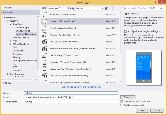
First of all,m take a new project and select the “Hub App” template. Give it a name simply “HubApp”.

1

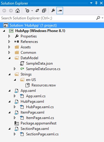
Now, you’ve all these files in your Solution Explorer.

2

So, first is first, we’ll replace the “SampleData.json” with our own file. Simple is to erase all the data in existing file and paste your desire data here. We’ve replace with our own data here.

{"Groups":[
    {
        "Title": "Letters of John Keats",
        "Subtitle": "Selected Love Letters to Fanny Brawne",
        "Items": [
            {
                "Title": "July 3, 1819",
                "Subtitle": "Shanklin, Isle of Wight, Thursday",
                "Content": "My dearest Lady - I am glad I had not an opportunity of sending off a Letter which I wrote for you on Tuesday night-'twas too much like one out of Rousseau's Heloise. I am more reasonable this morning. The morning is the only proper time for me to write to a beautiful Girl whom I love so much: for at night, when the lonely day has closed, and the lonely, silent, unmusical Chamber is waiting to receive me as into a Sepulchre, then believe me my passion gets entirely the sway, then I would not have you see those Rhapsodies which I once thought it impossible I should ever give way to, and which I have often laughed at in another, for fear you should [think me] either too unhappy or perhaps a little mad.\n\nI am now at a very pleasant Cottage window, looking onto a beautiful hilly country, with a glimpse of the sea; the morning is very fine. I do not know how elastic my spirit might be, what pleasure I might have in living here and breathing and wandering as free as a stag about this beautiful Coast if the remembrance of you did not weigh so upon me I have never known any unalloy'd Happiness for many days together: the death or sickness of someone has always spoilt my hours-and now when none such troubles oppress me, it is you must confess very hard that another sort of pain should haunt me.\n\nAsk yourself my love whether you are not very cruel to have so entrammelled me, so destroyed my freedom. Will you confess this in the Letter you must write immediately, and do all you can to console me in i-make it rich as a draught of poppies to intoxicate me-write the softest words and kiss them that I may at least touch my lips where yours have been. For myself I know not how to express my devotion to so fair a form: I want a brighter word than bright, a fairer word than fair. I almost wish we were butterflies and liv'd but three summer days-three such days with you I could fill with more delight than fifty common years could ever contain. But however selfish I may feel, I am sure I could never act selfishly: as I told you a day or two before I left Hampstead, I will never return to London if my Fate does not turn up Pam or at least a Court-card. Though I could centre my Happiness in you, I cannot expect to engross your heart so entirely-indeed if I thought you felt as much for me as I do for you at this moment I do not think I could restrain myself from seeing you again tomorrow for the delight of one embrace.\n\nBut no-I must live upon hope and Chance. In case of the worst that can happen, I shall still love you-but what hatred shall I have for another!\n\nSome lines I read the other day are continually ringing a peal in my ears:\n\nTo see those eyes I prize above mine own\nDart favors on another-\n\nAnd those sweet lips (yielding immortal nectar)\nBe gently press'd by any but myself-\nThink, think Francesca, what a cursed thing\nIt were beyond expression!\n\nJ.\n\nDo write immediately. There is no Post from this Place, so you must address Post Office, Newport, Isle of Wight. I know before night I shall curse myself for having sent you so cold a Letter; yet it is better to do it as much in my senses as possible. Be as kind as the distance will permit to your\n\nPresent my Compliments to your mother, my love to Margaret and best remembrances to your Brother-if you please so."
            },
            {
                "Title": "July 8, 1819",
                "Subtitle": "Unknown",
                "Content": "My sweet Girl-Your Letter gave me more delight than any thing in the world but yourself could do; indeed I am almost astonished that any absent one should have that luxurious power over my senses which I feel. Even when I am not thinking of you I receive your influence and a tenderer nature stealing upon me. All my thoughts, my unhappiest days and nights have I find not at all cured me of my love of Beauty, but made it so intense that I am miserable that you are not with me: or rather breathe in that dull sort of patience that cannot be called Life.\n\nI never knew before, what such a love as you have made me feel, was; I did not believe in it; my Fancy was afraid of it, lest it should burn me up. But if you will fully love me, though there may be some fire, 'twill not be more than we can bear when moistened and bedewed with Pleasures.\n\nYou mention 'horrid people' and ask me whether it depend upon them whether I see you again. Do understand me, my love, in this. I have so much of you in my heart that I must turn Mentor when I see a chance of harm befalling you. I would never see any thing but Pleasure in your eyes, love on your lips, and Happiness in your steps. I would wish to see you among those amusements suitable to your inclinations and spirits; so that our loves might be a delight in the midst of Pleasures agreeable enough, rather than a resource from vexations and cares. But I doubt much, in case of the worst, whether I shall be philosopher enough to follow my own Lessons: if I saw my resolution give you a pain I could not.\n\nWhy may I not speak of your Beauty, since without that I could never have lov'd you? I cannot conceive any beginning of such love as I have for you but Beauty. There may be a sort of love for which, without the least sneer at it, I have the highest respect and can admire it in others: but it has not the richness, the bloom, the full form, the enchantment of love after my own heart. So let me speak of your Beauty, though to my own endangering; if you could be so cruel to me as to try elsewhere its Power.\n\nYou say you are afraid I shall think you do not love me-in saying this you make me ache the more to be near you. I am at the diligent use of my faculties here, I do not pass a day without sprawling some blank verse or tagging some rhymes; and here I must confess, that, (since I am on that subject,) I love you the more in that I believe you have liked me for my own sake and for nothing else. I have met with women whom I really think would like to be married to a Poem and to be given away by a Novel. I have seen your Comet, and only wish it was a sign that poor Rice would get well whose illness makes him rather a melancholy companion: and the more so as so to conquer his feelings and hide them from me, with a forc'd Pun.\n\nI kiss'd your Writing over in the hope you had indulg'd me by leaving a trace of honey. What was your dream? Tell it me and I will tell you the interpretation threreof.Ever yours, my love!\n\nDo not accuse me of delay-we have not here any opportunity of sending letters every day. Write speedily."
            }
        ]
    }
]
}

Here, is a sample data of our application. We’ve used “Json”. “Json” stands for JavaScript Object Notation. Json is lightweight data interchange format. If you notice, you can realize that “Json” is nothing but an “Array” object. Here, the “Items” has two items and the items are surrounded by third brackets (“[]”), the last item doesn’t have comma at the end in line number 15. Mainly every last element doesn’t need comma at the end. You can declare as many items as you need, also you can have many group items. This is the basic format of “Json”. You can learn basics about “Json” at http://json.org.

So, out app local data is set, now we need to modify the class “SampleDataSouce.cs” like this.

// Sample Data Item Class
public class SampleDataItem
{
	public SampleDataItem(String title, String subtitle, String content)
	{
		this.Title = title;
		this.Subtitle = subtitle;
		this.Content = content;
	}

	public string Title { get; private set; }
	public string Subtitle { get; private set; }
	public string Content { get; private set; }

	public override string ToString()
	{
		return this.Title;
	}
}

// Sample Data Group Class
public class SampleDataGroup
{
	public SampleDataGroup(String title, String subtitle)
	{
		this.Title = title;
		this.Subtitle = subtitle;
		this.Items = new ObservableCollection<SampleDataItem>();
	}

	public string Title { get; private set; }
	public string Subtitle { get; private set; }
	public ObservableCollection<SampleDataItem> Items { get; private set; }

	public override string ToString()
	{
		return this.Title;
	}
}

public sealed class SampleDataSource
{
	private static SampleDataSource _sampleDataSource = new SampleDataSource();

	private ObservableCollection<SampleDataGroup> _groups = new ObservableCollection<SampleDataGroup>();
	public ObservableCollection<SampleDataGroup> Groups
	{
		get { return this._groups; }
	}

	public static async Task<IEnumerable<SampleDataGroup>> GetGroupsAsync()
	{
		await _sampleDataSource.GetSampleDataAsync();
		return _sampleDataSource.Groups;
	}

	public static async Task<SampleDataGroup> GetGroupAsync(string uniqueId)
	{
		await _sampleDataSource.GetSampleDataAsync();
		// Simple linear search is acceptable for small data sets
		var matches = _sampleDataSource.Groups.Where((group) => group.Title.Equals(uniqueId));
		if (matches.Count() == 1) return matches.First();
		return null;
	}

	public static async Task<SampleDataItem> GetItemAsync(string uniqueId)
	{
		await _sampleDataSource.GetSampleDataAsync();
		// Simple linear search is acceptable for small data sets
		var matches = _sampleDataSource.Groups.SelectMany(group => group.Items).Where((item) => item.Title.Equals(uniqueId));
		if (matches.Count() == 1) return matches.First();
		return null;
	}

	private async Task GetSampleDataAsync()
	{
		if (this._groups.Count != 0)
			return;

		Uri dataUri = new Uri("ms-appx:///DataModel/SampleData.json");

		StorageFile file = await StorageFile.GetFileFromApplicationUriAsync(dataUri);
		string jsonText = await FileIO.ReadTextAsync(file);
		JsonObject jsonObject = JsonObject.Parse(jsonText);
		JsonArray jsonArray = jsonObject["Groups"].GetArray();

		foreach (JsonValue groupValue in jsonArray)
		{
			JsonObject groupObject = groupValue.GetObject();
			SampleDataGroup group = new SampleDataGroup(groupObject["Title"].GetString(),
														groupObject["Subtitle"].GetString());

			foreach (JsonValue itemValue in groupObject["Items"].GetArray())
			{
				JsonObject itemObject = itemValue.GetObject();
				group.Items.Add(new SampleDataItem(itemObject["Title"].GetString(),
												   itemObject["Subtitle"].GetString(),
												   itemObject["Content"].GetString()));
			}
			this.Groups.Add(group);
		}
	}
}

Another approach of “Json” you can have is given below.

{"Groups":[
    {
        "Title": "Letters of John Keats",
        "Subtitle": "Selected Love Letters to Fanny Brawne",
        "Items": [
            {
                "Title": "July 3, 1819",
                "Subtitle": "Shanklin, Isle of Wight, Thursday",
                "Content": 
				[
					"My dearest Lady - I am glad I had not an opportunity of sending off a Letter which I wrote for you on Tuesday night-'twas too much like one out of Rousseau's Heloise. I am more reasonable this morning. The morning is the only proper time for me to write to a beautiful Girl whom I love so much: for at night, when the lonely day has closed, and the lonely, silent, unmusical Chamber is waiting to receive me as into a Sepulchre, then believe me my passion gets entirely the sway, then I would not have you see those Rhapsodies which I once thought it impossible I should ever give way to, and which I have often laughed at in another, for fear you should [think me] either too unhappy or perhaps a little mad.",

					"I am now at a very pleasant Cottage window, looking onto a beautiful hilly country, with a glimpse of the sea; the morning is very fine. I do not know how elastic my spirit might be, what pleasure I might have in living here and breathing and wandering as free as a stag about this beautiful Coast if the remembrance of you did not weigh so upon me I have never known any unalloy'd Happiness for many days together: the death or sickness of some one has always spoilt my hours-and now when none such troubles oppress me, it is you must confess very hard that another sort of pain should haunt me.",

					"Ask yourself my love whether you are not very cruel to have so entrammelled me, so destroyed my freedom. Will you confess this in the Letter you must write immediately, and do all you can to console me in it-make it rich as a draught of poppies to intoxicate me-write the softest words and kiss them that I may at least touch my lips where yours have been. For myself I know not how to express my devotion to so fair a form: I want a brighter word than bright, a fairer word than fair. I almost wish we were butterflies and liv'd but three summer days-three such days with you I could fill with more delight than fifty common years could ever contain. But however selfish I may feel, I am sure I could never act selfishly: as I told you a day or two before I left Hampstead, I will never return to London if my Fate does not turn up Pam or at least a Court-card. Though I could centre my Happiness in you, I cannot expect to engross your heart so entirely-indeed if I thought you felt as much for me as I do for you at this moment I do not think I could restrain myself from seeing you again tomorrow for the delight of one embrace.",

					"But no-I must live upon hope and Chance. In case of the worst that can happen, I shall still love you-but what hatred shall I have for another!",

					"Some lines I read the other day are continually ringing a peal in my ears:",

					"To see those eyes I prize above mine own",
					"Dart favors on another-",
					"And those sweet lips (yielding immortal nectar)",
					"Be gently press'd by any but myself-",
					"Think, think Francesca, what a cursed thing",
					"It were beyond expression!",

					"J.",
					"Do write immediately. There is no Post from this Place, so you must address Post Office, Newport, Isle of Wight. I know before night I shall curse myself for having sent you so cold a Letter; yet it is better to do it as much in my senses as possible. Be as kind as the distance will permit to your",
					"Present my Compliments to your mother, my love to Margaret and best remembrances to your Brother-if you please so."
				]
            }
        ]
    }
]
}

Then, you have to change this line of code in “SampleDataSouce.cs”

foreach (JsonValue itemValue in groupObject["Items"].GetArray())
{
	JsonObject itemObject = itemValue.GetObject();
	group.Items.Add(new SampleDataItem(itemObject["Title"].GetString(),
									   itemObject["Subtitle"].GetString(),
									   itemObject["Content"].Stringify().Replace("[", "").Replace("]", "").Replace("\",", "\n").Replace("\"", "")));
}

I personally don’t like to do that, because you can’t use double quote and “\n” or “\r” in this case. Or you may find it helpful in some cases.

Now, we’ll modify the “HubPage.xaml” first. We don’t need the other sections of “HubPage.xaml” for our appliction.

<Page.Resources>
	<DataTemplate x:Key="HubSectionHeaderTemplate">
		<TextBlock Margin="0,0,0,-9.5" Text="{Binding}"/>
	</DataTemplate>
</Page.Resources>

<Grid x:Name="LayoutRoot">
	<Hub x:Name="Hub" x:Uid="Hub" Header="application name" Background="{ThemeResource HubBackgroundImageBrush}">
		<HubSection x:Uid="HubSection1" Header="{Binding Subtitle}" DataContext="{Binding Groups[0]}" HeaderTemplate="{ThemeResource HubSectionHeaderTemplate}" Width="400">
			<DataTemplate>
				<ListView
					ItemsSource="{Binding Items}"
					IsItemClickEnabled="True"
					ItemClick="ItemView_ItemClick"
					ContinuumNavigationTransitionInfo.ExitElementContainer="True">
					<ListView.ItemTemplate>
						<DataTemplate>
							<StackPanel Grid.Column="1" Margin="14.5,0,0,0">
								<TextBlock Text="{Binding Title}" Style="{ThemeResource ListViewItemTextBlockStyle}"/>
								<TextBlock Padding="10" Text="{Binding Subtitle}" Style="{ThemeResource ListViewItemSubheaderTextBlockStyle}"/>
								<Line  x:Name="line" X1="0" Y1="5" X2="365" Y2="5"  Stroke="Brown" StrokeThickness="2"></Line>
							</StackPanel>
						</DataTemplate>
					</ListView.ItemTemplate>
				</ListView>
			</DataTemplate>
		</HubSection>
	</Hub>
</Grid>

Lemme explain, what I’ve done here. In line number 9, you can see that we’ve bound header element with “Subtitle”. It’s actually “Groups'” subtitle because our “Datacontext” is “Groups[0]” index, the first group content. In line number we’ve bound “ItemSource” to “Items”, so it’ll fetch all “Items” data. And in line number in line number 14 we’ve a click event name “ItemView_ItemClick”. When you click an item, it’ll bring the “ItemPage.xaml” to view the details of Items. In line number 19 & 20 we’ve bound the value “Title” & “Subtitle”. In line number 21 we’ve used a line to separate the items title and subtile with different items.

3

Now if we look at the “HubPage.xaml.cs”, we just modify the “ItemView_ItemClick” event like this.

private void ItemView_ItemClick(object sender, ItemClickEventArgs e)
{
	// Navigate to the appropriate destination page, configuring the new page
	// by passing required information as a navigation parameter
	var itemTitle = ((SampleDataItem)e.ClickedItem).Title;
	if (!Frame.Navigate(typeof(ItemPage), itemTitle))
	{
		throw new Exception(this.resourceLoader.GetString("NavigationFailedExceptionMessage"));
	}
}

Here in line number 5, we declare a variable “itemTitle” and set it to the title of “Items”, and pass it through the “Frame.Navigation()” as a parameter in line number 6. We don’d need the “GroupSection_ItemClick” event because we aren’t using “SectionPage.xaml” in our application. So we’re working only two different pages, first is “HubPage.xaml” and second is “ItemPage.xaml”. So, you can understand that you got some real power to to present a lots of data simply in two pages. So DataBinding and Json give us lots of flexibility to make our apps much faster and efficient.

Now, were gonna modify our “ItemPage.xaml”, just put these three lines of code.

<ScrollViewer>
	<StackPanel Grid.Column="1" Margin="14.5,0,0,0">
		<TextBlock Text="{Binding Title}" Style="{ThemeResource ListViewItemTextBlockStyle}"/>
		<TextBlock Padding="10,0,0,20" Text="{Binding Subtitle}" Style="{ThemeResource ListViewItemSubheaderTextBlockStyle}"/>
		<TextBlock Padding="0,0,0,10" TextWrapping="Wrap" Text="{Binding Content}" FontSize="20" Style="{ThemeResource ListViewItemSubheaderTextBlockStyle}"/>
	</StackPanel>
</ScrollViewer>

Here, the we’ve three TextBlocks, and first one is showing the items “Title”, second one is “Subtitle” and third one is “Content” which contains the letter body. We surround the TextBlocks with a StackPanel and ScrollViewer so that, you can see long text with scrolling option. One important thing is in line number 5 we’ve used TextWrapping to “Wrap” so that, the texts fit in the window size.

One more extra thing you can do is to modify your “SectionPage.xaml”. Though I’m not using this page, just showing if you want to use. Modify the “SectionPage.xaml” like this, here is only “ListView”.

<ListView
	x:Name="itemListView"
	AutomationProperties.AutomationId="ItemListView"
	AutomationProperties.Name="Items In Group"
	TabIndex="1"
	Grid.Row="1"
	ItemsSource="{Binding Items}"
	IsItemClickEnabled="True"
	ItemClick="ItemView_ItemClick"
	SelectionMode="None"
	IsSwipeEnabled="false"
	Margin="19,0,0,0">
	<ListView.ItemTemplate>
		<DataTemplate>
			<Grid>
				<Grid.ColumnDefinitions>
					<ColumnDefinition Width="Auto"/>
					<ColumnDefinition Width="*"/>
				</Grid.ColumnDefinitions>

				<StackPanel Grid.Column="1" VerticalAlignment="Top" Margin="10,0,0,0">
					<TextBlock Text="{Binding Title}" Style="{ThemeResource ListViewItemTextBlockStyle}"/>
					<TextBlock Text="{Binding Subtitle}" Style="{ThemeResource ListViewItemSubheaderTextBlockStyle}"/>
				</StackPanel>
			</Grid>
		</DataTemplate>
	</ListView.ItemTemplate>
</ListView>

We just used the “Title” & “Subtitle” section. Also the “ItemView_ItemClick” event in “SectionPage.xaml.cs” like this.

private void ItemView_ItemClick(object sender, ItemClickEventArgs e)
{
	var itemTitle = ((SampleDataItem)e.ClickedItem).Title;
	if (!Frame.Navigate(typeof(ItemPage), itemTitle))
	{
		var resourceLoader = ResourceLoader.GetForCurrentView("Resources");
		throw new Exception(resourceLoader.GetString("NavigationFailedExceptionMessage"));
	}
}

We’ve declare a variable “itemTitle” and pass it through navigation. That’s it.

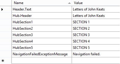
Now change the “Header.Text” & “Hub.Header” in “Strings>>en-US>>Resources.resw” like this.

5

Also, we want to change the background of our app, so that it looks more beautiful and readable. Go to “App.xaml” and change the background like below.

<Application.Resources>
	<ResourceDictionary>
		<ResourceDictionary.ThemeDictionaries>
			<ResourceDictionary x:Key="Default">
				<ImageBrush x:Key="HubBackgroundImageBrush" ImageSource="Assets/HubBackground.theme-light.png" Opacity="0.3"/>
			</ResourceDictionary>
			<ResourceDictionary x:Key="HighContrast">
				<ImageBrush x:Key="HubBackgroundImageBrush" ImageSource="{x:Null}"/>
			</ResourceDictionary>
		</ResourceDictionary.ThemeDictionaries>

	</ResourceDictionary>
</Application.Resources>

here, we changed the background of the app, just by changing the picture. You’ll find it in the “Assets” folder or you can upload your own choose picture. Also we changed the opacity to “0.3” so the background becomes darker than as it is.

Now your design should look like this.

4

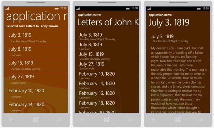
Now we’re all set. If we, run the application, it looks just awesome like this.

a

b

So, we just made a rich “Json Data Hub” application doing few modification of “Hub App” template. I personally make an app about my favorite poet John Keats’ letters to his girl friend Fanny Brawne and you can make your own data bound app like this.

Hopefully you’ve enjoyed this. That’s it for today. I’ll be here with a new topic soon. Till then good bye. Have a nice day.

Happy Coding!

You can download the full source code from here,
Download link: http://1drv.ms/1vXO4R2

Windows Phone – Extended Splash Screen with Progress Bar

Welcome again! In my previous article I’ve talked about Windows Phone “Package.appxmanifest”. I’ve shown there, how to add custom application logos with different resolution. It makes your app much beautiful and attractive.

One more thing to add in your application is “Splash Screen”. This gives you a nice representation of your app and yourself or your company. So, how you can do that? It’s really simple to add a “Splash Screen” in Windows Phone 8.1 with Visual Studio 2013 update 3. Just go to “Package.appxmanifest” and open “Visual Assets” tab. Then you can find “Splash Screen” at the bottom.

1

All you have to do, is just upload your “Splash Screen” in your project and locate this file. This will brings the “Splash Screen” when someone open the application, but it’ll vanish in blink of an eye. To make effective, we need to add “Splash Screen” in a different way. We call it “Extended Splash Screen”.

So let’s get crack in Windows Phone “Extended Splash Screen with Progress Bar”. First of all, take “Blank App” template, give it a name “ExtendedSplash.xaml” and customize your main grid like this.

<Grid>
	<Image x:Name="extendedSplashImage" Source="Images/SplashScreen.png" Stretch="Fill"/>
	<Canvas>
		<ProgressBar IsIndeterminate="True" Maximum="100" Value="30" Height="10" Width="400"/>
	</Canvas>
</Grid>

Here, we’ve also taken a “ProgressBar” control to indicate that the application is running while displaying the “Splash Screen”. It makes the application really cool.Now in “ExtendedSplash.xaml.cs” put this method below and call it from the constructor, like this.

public ExtendedSplash()
{
	this.InitializeComponent();

	//Call MainPage from ExtendedSplashScreen after some delay
	ExtendeSplashScreen();
}

async void ExtendeSplashScreen()
{
	await Task.Delay(TimeSpan.FromSeconds(3)); // set your desired delay
	Frame.Navigate(typeof(MainPage)); // call MainPage
}

Here we’ve ue an async method named “ExtendeSplashScreen” and make it delayed till three seconds. Then it’ll bring the “MainPage.xaml”.

One more thing to do, is make the start up page to “ExtendedSplash.xaml” otherwise the splach screen will not work. To do so, go to “App.xaml.cs” and find “OnLaunched” method, and at the bottom you’ll find “rootFrame.Navigate(typeof(MainPage), e.Arguments)”, change “MainPage” to “ExtendedSplash” which we’ve named to our “Splash Screen”.

if (!rootFrame.Navigate(typeof(ExtendedSplash), e.Arguments))
{
	throw new Exception("Failed to create initial page");
}

Now, we’ve set all things to make work our “Splash Screen”. But it’s really important to understand the Windows Phone page navigation service. We’ve set the starting page to our “Splash Screen” and after three seconds it’ll bring the “Main Page”. But when we want to go back, it’ll bring the “Splash Screen” again and after three seconds it’ll bring the “Main Page” again. So it’s just irritating. To avoid this problem we need to add a method called “HardwareButtons_BackPressed” in “MainPage.xaml.cs”

void HardwareButtons_BackPressed(object sender, Windows.Phone.UI.Input.BackPressedEventArgs e)
{
	Frame frame = Window.Current.Content as Frame;
	if (frame == null)
	{
		return;
	}

	if (frame.CanGoBack)
	{
		frame.GoBack();
		//Indicate the back button press is handled so the app does not exit
		e.Handled = true;
	}
}

Here, we make Frame object name “frame” and if it’s not null and if we’ve a go back state, then we make “e.Handled” equal to true, so that app doesn’t exit. If you make it false, the app will exit when you press the back button. Another problem is, if you have multiple of pages then it will bring the “Splash Screen” instead of bringing the previous page because of calling the method “GoBack”. We need this for another purpose which I’m talking later.

Now, we’re handling the “Can go back” task, but our problem still exists. To solve this problem we need to check the “Back State” situation. If the “Back State” equals to one, then we’ve only one page remaining and it’s obviously our “Splash Screen”. So, we just need to remove the “Back State” so that our app can exit. To do so, just put this code inside the “OnNavigatedTo” method.

// Check if ExtendedSplashscreen.xaml is on the backstack  and remove 
if (Frame.BackStack.Count() == 1)
{
	Frame.BackStack.RemoveAt(Frame.BackStackDepth - 1);
}

Now, back to unfinished topic is why we need to use “frame.Goback” method, becauese if we don’t use it we’ll get an exception when we’ll navigate through multiple pages and press back key. To avoid that, we need this method. Now, run the application and it’ll work just fine.

m

If you look closely, you can see “Progress Bar” top of the “Splash Screen” and it’ll be displaying for three seconds, then the “MainPage” will come.

So, that’s it. Hope you’ve understand all these things. I’ll be here with a new topic soon. Till then good bye. Have a nice day. Happy coding.

You can download the full souce code from here,
Download link: http://1drv.ms/1FbBeBy

Windows Phone – Package.appxmanifest

Welcome again! Today I’ll talk about Windows Phone “Package.appxmanifest”. It’s really very important to make your app fully complete. Because just designing and lots of code don’t make a good app, the look of the app must be very attractive. Look and feel is very important to attract a customer. Moreover, not only look but also the capabilities and dependencies of app are need to set in “Package.appxmanifest”.

So let’s explore the Windows Phone “Package.appxmanifest”. Just open up the “Package.appxmanifest” from your “Solution Explorer”, and you can see the similar picture below.

2

I’ve used my previous example of Windows Phone XAML Styling here. You can use any of existing application or just create a new one.

If you take a look at the picture, “Display name” and “Description” have tha same content “XAMLStyling”. Yes, it’s our app name, we’ve given before. But does it look good, when we run the application?

f

g

The answer will obviously “No”. So we just need to little bit of work. Just give a space between “XAML” and “Style”, so it’ll be “XAML Style”.

3

One more thing we’ve to do is, switch to the “Visual Assets” tab and check the “Check Box” below “Title”.

4

After that you’ll get some good visualization of you app’s tiles.

h

i

Very important thing is to change the application logo. It’s your app’s unique identity. So, select the list item one by one and change your logo. But before that you’ve to upload your logo to your project solution. To do that, right click one the project and a add a new foldr. Give it a name “Images”. Right click on the folder and click Add >> Existing Item.

6

Upload all required logos of corresponding resolution.

8

Now, locate all the logos in “Visual Assets” section.

9

Logo must be in “png” format and if it’s transparent then it’ll be better for visualizing some information. Locate all these logos one by one. After you’ve changed the logos, save it. If you run the application, it’ll look like this.

j

k

l

Well, we’ve done some major modification of our application. There’re some other parts like “Requirements”.

10

If you use sensors and camera API then you need to check the option, you’ve used in your application.

One more thing is “Capabilities”.

11

If you use microphone, location service, internet, proximity or any other things, you need to check these options as well. Otherwise your application will not work.

There’re some other option like “Declaration”, “Content URls” and “Packaging”. You can also change these things as well. I’ve shown the common things here.

So, that’s it. Hope you’ve no understanding about Windows Phone “package.appxmanifest”. Keep digging with Visual Studio and try to lean everyday new things. I’ll be here with a new topic soon. Till then good bye. Have a nice day. happy coding.

You can download the logos from here, try to do yourself.
Download link: http://1drv.ms/1rgqgjS

Windows Phone XAML Styling

Welcome again! Today I’ll talk about XAML styling. How you can make your XAML controls more beautiful and customized. If you search “windows phone xaml style” you’ll get some helpful references. Styling XAML is not only for customizing your controls but also make code much clean and easily readable. So let’s get crack in Windows Phone XAML Styling.

I’ll just try to explain how you can use XAML styling in you existent projects. I’m just going to modify my existing user control to show you the procedure. If you’ve read my Windows Phone Controls – Part 1 article, then you can understand the difference between previous and current XAML code. I’ll not modify all the controls, but the “Popup Window”. I’ve used a “User Control”, I’ll just modify that page.

First of take a new Project and add a new “User Control”. We’ve used these XAML code in our previous Project.

<Grid>
    <Border BorderBrush="{StaticResource ApplicationForegroundThemeBrush}" BorderThickness="1" Background="{StaticResource ApplicationPageBackgroundThemeBrush}">
        <Border BorderBrush="{StaticResource ApplicationForegroundThemeBrush}" BorderThickness="1">
            <Border BorderBrush="{StaticResource ApplicationForegroundThemeBrush}" BorderThickness="1">
                <Border BorderBrush="{StaticResource ApplicationForegroundThemeBrush}" BorderThickness="1">
                    <StackPanel Orientation="Vertical" Height="200" Width="200" VerticalAlignment="Center">
                        <TextBlock Text="This is a Popup!" VerticalAlignment="Center" HorizontalAlignment="Center" Margin="0,60,0,0"/>
                        <TextBlock Text="Hit the button again to hide me" VerticalAlignment="Center" HorizontalAlignment="Center" Margin="0,10,0,0" TextWrapping="Wrap" TextAlignment="Center"/>
                        <Button HorizontalAlignment="Center" Content="Close Popup" Click="ClosePopup" />
                    </StackPanel>
                </Border>
            </Border>
        </Border>
    </Border>
</Grid>

and the design is look like this.

5

Now, we’ll use XAML styling in the same XAML code and make it much clean and customized as well. To do so, you’ve to put resources as shown below.

<UserControl
...
    d:DesignWidth="400">
    
    <UserControl.Resources>
    ...
    </UserControl.Resources>

    <Grid>
    ...
    </Grid>
</UserControl>

All you’ve to do, is put all your style properties inside the Resources tag. First of all we’ll create a “Border Style” for our “Border” control.

<UserControl.Resources>
	<Style x:Key="BorderStyle" TargetType="Border">
		<Setter Property="BorderThickness" Value="2"/>
		<Setter Property="CornerRadius" Value="0,10,0,10"/>
	</Style>
</UserControl.Resources>

Note: If you’re using this in Blank of Basic pages, the code will be like this.

<Page.Resources>
	<Style x:Key="BorderStyle" TargetType="Border">
		<Setter Property="BorderThickness" Value="2"/>
		<Setter Property="CornerRadius" Value="0,10,0,10"/>
	</Style>
</Page.Resources>

As we’re using a “User Control”, so we used “UserControl.Resources”.

Here, we’re considering only one “Border” control. If you look above the code, we gave the style name “BorderStyle” and set target to “Border”. In which control you work, you’ve to give a unique name and set target of that contol. Also, we’ve set a property name “BorderThickness” and set value to “2”, which will make the thickness of the border’s outer edges. And we’ve also set “CornerRadious” to “0,10,0,10”, which will make the upper right and lower left corner edges little bit round.

1

Now, similarly we’ve added “TextBox” and “Button” styles.

<UserControl.Resources>
	<Style x:Key="BorderStyle" TargetType="Border">
		<Setter Property="BorderThickness" Value="2"/>
		<Setter Property="CornerRadius" Value="0,10,0,10"/>
	</Style>
	<Style x:Key="StackPanelStyle" TargetType="StackPanel">
		<Setter Property="Orientation" Value="Vertical"/>
		<Setter Property="VerticalAlignment" Value="Center"/>
		<Setter Property="Height" Value="200"/>
		<Setter Property="Width" Value="200"/>
	</Style>
	<Style x:Key="ButtonStyle" TargetType="Button">
		<Setter Property="HorizontalAlignment" Value="Center"/>
		<Setter Property="Content" Value="Close Popup"/>
		<Setter Property="Background" Value="Green"/>
	</Style>
	<Style x:Key="TextBlockStyle" TargetType="TextBlock">
		<Setter Property="VerticalAlignment" Value="Center"/>
		<Setter Property="HorizontalAlignment" Value="Center"/>
		<Setter Property="Text" Value="This is a Popup!"/>
		<Setter Property="Margin" Value="0,60,0,0"/>
		<Setter Property="Foreground" Value="Red"/>
	</Style>
	<Style x:Key="TextBlockStyle1" TargetType="TextBlock">
		<Setter Property="VerticalAlignment" Value="Center"/>
		<Setter Property="HorizontalAlignment" Value="Center"/>
		<Setter Property="TextAlignment" Value="Center"/>
		<Setter Property="TextWrapping" Value="Wrap"/>
		<Setter Property="Text" Value="Hit the button again to hide me."/>
		<Setter Property="Margin" Value="0,10,0,0"/>
		<Setter Property="Foreground" Value="Gray"/>
	</Style>
</UserControl.Resources>

If you take a look the old XAML code, you can see all the properties are here exactly, exception in “Botton” click event. You’ve to put this event in the main Grid’s “Button” control code.

<Grid>
	<Border BorderBrush="{StaticResource ApplicationForegroundThemeBrush}" 
			Background="{StaticResource ApplicationPageBackgroundThemeBrush}"
			Style="{StaticResource BorderStyle}">   
		<StackPanel Style="{StaticResource StackPanelStyle}">
			<TextBlock Style="{StaticResource TextBlockStyle}"/>
			<TextBlock Style="{StaticResource TextBlockStyle1}"/>
			<Button Style="{StaticResource ButtonStyle}" Click="ClosePopup" />
		</StackPanel>
	</Border>
</Grid>

All you need to do is just reference the styles in corresponding controls. Like in “Border” control we’ve used “Style=”{StaticResource BorderStyle}”.. “. After the “StaticResource” name the Style name.

Another important thing you can do is to separate the XAML styling into different location. To make much clean XAML. To do so, just open “App.xaml” and put the same code there, like this

<Application
...
	>
    <!--Application Resources-->
    <Application.Resources>
        <Style x:Key="BorderStyle" TargetType="Border">
            <Setter Property="BorderThickness" Value="2"/>
            <Setter Property="CornerRadius" Value="5"/>
        </Style>
        <Style x:Key="StackPanelStyle" TargetType="StackPanel">
            <Setter Property="Orientation" Value="Vertical"/>
            <Setter Property="VerticalAlignment" Value="Center"/>
            <Setter Property="Height" Value="200"/>
            <Setter Property="Width" Value="200"/>
        </Style>
    </Application.Resources>
</Application>

Only difference is the tag, here it should be “Application.Resources”, because it’s in “App.xaml” file. So, the tag structure should like “Type.Resources”. Here type can “Page”, “Application”, “UserControl” etc.

Now, in “Main Page.xaml” take Button control to show the “Popup Window”,

<Page.Resources>
	<Style x:Key="ButtonStyle" TargetType="Button">
		<Setter Property="Name" Value="PopupButton"/>
		<Setter Property="HorizontalAlignment" Value="Left"/>
		<Setter Property="VerticalAlignment" Value="Top"/>
		<Setter Property="Width" Value="140"/>
		<Setter Property="Margin" Value="10,0,0,0"/>
		<Setter Property="Content" Value="Show Popup"/>
	</Style>
</Page.Resources>

<Grid>
	<Button Style="{StaticResource ButtonStyle}" Click="PopupButton_Click"/>
</Grid>

and C# code of this “Button” event handler is given below.

private void PopupButton_Click(object sender, RoutedEventArgs e)
{
	if (!popup.IsOpen)
	{
		popup.Child = new PopupPanel();
		popup.VerticalOffset = 250.0;
		popup.HorizontalOffset = 100.0;
		popup.IsOpen = true;
	}
}

Popup popup = new Popup();

So, if you run the application it’ll look like this.

d

e

Here, we’ve another sample, which “Popup Window” is round. You can simply do that just changing this code in “PopupPanel.xaml”

<Page.Resources>
	<Style x:Key="BorderStyle" TargetType="Border">
		<Setter Property="BorderThickness" Value="2"/>
		<Setter Property="CornerRadius" Value="100"/>
	</Style>
</Page.Resources>

Hope, you’ve understand the basic of XAML styling. I’ll be here with a new topic soon. Till then good bye. Have nice day. Happy coding.

You can download the full source code from here,
Download link: http://1drv.ms/1xVS0Qj

Windows Phone – Command Bar

Welcome again! Today I’ll talk about a simple but useful topic “Windows Phone Command Bar”. If you’ve previous experience about Windows Phone 7 or 8, you could have noticed that, in Windows Phone 8.1 they made a little bit change. Previously we’re familiar with “App Bar”, now it’s known as “Command Bar”. Obviously the code segment also changed than before. So, let’s get crack in Windows Phone Command Bar.

First of all, open up a new project or you can simply load your previous project. Now, in your left-side of Visual Studio, you can see a side window named “Document Outline”. Just right click on the “BottomAppBar” and add a “Command Bar”.

1

Now, you’ll notice that, it automatically generates a XAML code snippet for you.

<Page.BottomAppBar>
	<CommandBar>
		<AppBarButton Icon="Accept" Label="appbarbutton"/>
		<AppBarButton Icon="Cancel" Label="appbarbutton"/>
	</CommandBar>
</Page.BottomAppBar>

Now, again right click on the “SecondaryCommands” and add a new “AppBarButton”.

2

And you can see it creates another menu button for your “Command Bar”, and your XAML code will look like this.

<Page.BottomAppBar>
	<CommandBar>
		<CommandBar.SecondaryCommands>
			<AppBarButton Label="about"/>
		</CommandBar.SecondaryCommands>
		<AppBarButton Label="accept" Icon="Accept"/>
		<AppBarButton Label="cancel" Icon="Cancel"/>
	</CommandBar>
</Page.BottomAppBar>

We’ve modified the labels of “Accept” and “Cancel” button, it shows the hint about the “Command Bar” buttons, and changed the label of “AppBarButton” to “about”.

Now, you can change the icons of your “Command Bar”, as you see in the picture below, it already set to “Accept” icon. Because we’ve selected the “accept” button in the XAML code.

4

Or you can choose a “font icon” as your Icon, like “A”, “B” or anything you want.

5

If you change “Accept” to “A” and “Cancel” to “C”, the code will look like this.

<Page.BottomAppBar>
	<CommandBar>
		<CommandBar.SecondaryCommands>
			<AppBarButton Label="about"/>
		</CommandBar.SecondaryCommands>
		<AppBarButton Label="accept">
			<AppBarButton.Icon>
				<FontIcon Glyph="A"/>
			</AppBarButton.Icon>
		</AppBarButton>
		<AppBarButton Label="cancel">
			<AppBarButton.Icon>
				<FontIcon Glyph="C"/>
			</AppBarButton.Icon>
		</AppBarButton>
	</CommandBar>
</Page.BottomAppBar>

You can also changed the mode of “Command Bar”. For this, all you’ve to do, is just make some change in your “” tag like the picture below.

6

You’ve to select the “Minimal” view of “ClosedDisplayMode”.

<Page.BottomAppBar>
	<CommandBar ClosedDisplayMode="Minimal">
		<CommandBar.SecondaryCommands>
			<AppBarButton Label="about"/>
		</CommandBar.SecondaryCommands>
		<AppBarButton Label="accept">
			<AppBarButton.Icon>
				<FontIcon Glyph="A"/>
			</AppBarButton.Icon>
		</AppBarButton>
		<AppBarButton Label="cancel">
			<AppBarButton.Icon>
				<FontIcon Glyph="C"/>
			</AppBarButton.Icon>
		</AppBarButton>
	</CommandBar>
</Page.BottomAppBar>

Now let’s go back to previous changes and give a event handler in “about” button. To do so, in XAML code select the “” this line and under the “Solution Explorer”, you can see a “Properties” window and select the thunder sign like the picture below,

9

and double click on the “Click” section and it automatically generates the code block for you.

10

If you take a look at the XAML code, you can see exactly like this.

<Page.BottomAppBar>
	<CommandBar ClosedDisplayMode="Minimal">
		<CommandBar.SecondaryCommands>
			<AppBarButton Label="about" Click="AppBarButton_Click"/>
		</CommandBar.SecondaryCommands>
		<AppBarButton Label="accept" Icon="Accept"/>
		<AppBarButton Label="cancel" Icon="Cancel"/>
	</CommandBar>
</Page.BottomAppBar>

As, we’ve made an event handler for our “about” button, so we have to take another page named “About.xaml” and we’ll navigate to that page if someone tap on the “about” button.

So, when you’ve done adding a new page, go to the “MainPage.xaml.cs” or wherever you’ve done this. In our case, we created our “Command Bar” in “MainPage.xaml”, and you can see this code block in that page.

11

When’ve done, the code will look like this.

private void AppBarButton_Click(object sender, RoutedEventArgs e)
{
	Frame.Navigate(typeof(About));
}

After all you set, run the application and it will look likes this.

a

b

c

When you tap on the “about” button, it navigates to the “About.xaml” page. So, that’s it. I think you got the basic idea how to use “Command Bar” in Windows Phone 8.1.

I’ll be here, with a new topic soon. Till then good bye. Have a nice day. Happy coding.

You can download the full source code from here,
Download link: http://1drv.ms/1yqPkwZ

MVVM – Simple Way You Can Think

Hello Everyone, previously I’ve posted about Data Binding. Today, we’ll talk about one the most important and little bit advanced topic. It’s all about “MVVM”. “MVVM” stands for Model-View-ViewModel. Model basically initialize properties, attributes whatever you say, and ViewModel contains all data of your application. Finally View represents actual data in your screen. Basically Data Binding works between ViewModel and View layer, View requests command and ViewModel accept it and responses to the View. I’m not going the whole theoretical knowledge. I tried to give you the basic idea what “MVVM” is.

Now, let’s get crack in the best practice in this super awesome architectural model.

First of all, open up a new project and name it “MVVMEx” or whatever you want. Now, simply delete your “Mainpage.xaml”. Don’t freak out, it’s kinda cool. Now, add three folder “Models”, “ViewModels” and “Views” one by one, like this.

1

It should look exactly like below.

2

Now, it kinda remake of our Data Binding example from my last blog. Now, In “Views” folder right click and add a new “Basic Page”, give it a name “AutoView”.

3

Now one more thing we’ve to do, is changing our starting window. For that, you’ve to go “app.xaml.cs” and change this line of code,

if (!rootFrame.Navigate(typeof(AutoView), e.Arguments))
{
	throw new Exception("Failed to create initial page");
}

because, we’ve deleted our “MainPage.xaml” and add a new page “AutoView.xaml”.

Now, similarly right click on the “Model” folder and add a new class named “Auto.cs”. Again right click on the “ViewModels” folder and add another class named “AutoViewModel.cs”. After all you setup, your Solution Explorer will look like this.

5

Now, as we’ll do similarly as our previous Data Binding example, now we’ll modify our “AutoView.xaml” as follows.

Setting up app title and information.

<!-- Title Panel -->
<StackPanel Grid.Row="0" Margin="19,0,0,0">
	<TextBlock Text="Learn With BD Devs" Style="{ThemeResource TitleTextBlockStyle}" Margin="0,12,0,0"/>
	<TextBlock Text="MVVM" Margin="0,-6.5,0,26.5" Style="{ThemeResource HeaderTextBlockStyle}" CharacterSpacing="{ThemeResource PivotHeaderItemCharacterSpacing}"/>
</StackPanel>

Modifying main grid.

<!--TODO: Content should be placed within the following grid-->
<Grid Grid.Row="1" x:Name="ContentRoot" Margin="19,9.5,19,0">
	<TextBlock Height="50"
			   HorizontalAlignment="Left"
			   Margin="10,10,0,0"
			   Name="manufacturerBlock"
			   Text="{Binding manufacturer,Mode=OneWay}"
			   VerticalAlignment="Top" 
			   Width="342" FontSize="24"/>
	<TextBlock Height="50" 
			   HorizontalAlignment="Left"
			   Margin="10,65,0,0"
			   Name="modelBlock"
			   Text="{Binding model,Mode=OneWay}"
			   VerticalAlignment="Top"
			   Width="342" FontSize="24"/>
	<TextBlock Height="50"
			   HorizontalAlignment="Left"
			   Margin="10,120,0,0"
			   Name="colorBlock"
			   Text="{Binding color,Mode=OneWay}"
			   VerticalAlignment="Top"
			   Width="342" FontSize="24"/>
	<TextBlock Height="50"
			   HorizontalAlignment="Left"
			   Margin="10,175,0,0"
			   x:Name="yearBlock"
			   Text="{Binding year, Mode=OneWay}"
			   VerticalAlignment="Top"
			   Width="342" FontSize="24"/>
</Grid>

Now, we’ll move to our “Models” folder and initialize auto’s properties, but before that, we’ve to add another class name “BaseModel.cs” in our “Common” folder.

public class BaseModel : INotifyPropertyChanged
{
	public event PropertyChangedEventHandler PropertyChanged;

	protected bool SetProperty<T>(ref T storage, T value, [CallerMemberName] string propertyName = null)
	{
		if (object.Equals(storage, value)) return false;
		storage = value;
		this.OnPropertyChaned(propertyName);
		return true;
	}

	private void OnPropertyChaned(string propertyName)
	{
		var eventHandler = this.PropertyChanged;
		if (eventHandler != null)
			eventHandler(this, new PropertyChangedEventArgs(propertyName));
	}
}

It’s our INotifyPropertyChanged interface. As, we’ve said in best practice, you’ve make your code as much clean you can.

Now, move back to our “Auto.cs” class. The initialized properties are given below.

public class Auto : BaseModel
{
	private string _manufacturer;
	private string _model;
	private string _color;
	private int _year;

	public string manufacturer
	{
		get { return _manufacturer; }

		set { this.SetProperty(ref this._manufacturer, value); }
	}

	public string model
	{
		get { return _model; }

		set { this.SetProperty(ref this._model, value); }
	}

	public string color
	{
		get { return _color; }

		set { this.SetProperty(ref this._color, value); }
	}

	public int year
	{
		get { return _year; }

		set { this.SetProperty(ref this._year, value); }
	}
}

Here, we’ve inherited all the public properties of “BaseModel.cs” class, and fire the value of data in setter. Just simple logic of OOP (Object Oriented Programming).

Now, we’ll set the data of our “Auto” properties in “AutoViewModel.cs” class.

public class AutoViewModel : Auto
{
	Auto _auto = new Auto
	{
		manufacturer = "Oldsmobile",
		model = "Cutlas Supreme",
		color = "Silver",
		year = 1988
	};

	public AutoViewModel()
	{
		this.manufacturer = _auto.manufacturer;
		this.model = _auto.model;
		this.color = _auto.color;
		this.year = _auto.year;
	}
}

Here, we’ve used Inheritance and inherited “Auto.cs” class like before, so that we can access all the public properties of “Auto.cs” class.

We created a “_auto” object of “Auto.cs” class and initialize all the values here, and in constructor “AutoViewModel” we make references of these properties.

It’s almost done our work. Now, to visualize the data of our “AutoViewModel.cs” class, we have to instantiate in our “AutoView.xaml.cs” class. To do so, change these line of code as follows.

private AutoViewModel defaultViewModel = new AutoViewModel();

public AutoView()
{
	this.InitializeComponent();
...
	this.DataContext = defaultViewModel;
}

public AutoViewModel DefaultViewModel
{
	get { return this.defaultViewModel; }
}

Here, we’ve create a “defaultViewModel” object of “AutoViewModel.cs” class and make it the “DataContext” of our “AutoView.xaml.cs” class in constructor. It actually retrieve all data fromm “AutoViewModel” constructor and shows in “ContentRoot” grid of “AutoView.xaml”.

Now, it’s time to build our project. After you run the application, it should look exactly like this.

j

So, that’s it. Hope you’ve understand the concept of “MVVM”. It’s really helpful when you’ll work in big project and you’ve to handle a lots of data. I’ll be here with a new topic soon. Till then good bye. Have a nice day. happy coding.

You can download the full source code from here,
Download link: http://1drv.ms/1C2H1VI

Data Binding with INotifyPropertyChanged Interface

Welcome again! Today we’ll talk about a little bit advanced topic like Data Binding. It’s really useful when you’ve massively structured code, and you’ve handle a lots of data, not like our typical contols,
e.x., textBox1.Text = “Hello, world!”;

Data Binding is nothing but creating a ViewModel class, which actually contains the data. One more important thing, you must follow in Data Binding control is INotifyPropertyChanged. It actually gives you an alert, when a property value is changed. Just like hey there, I’m changed. We’ll come back it later.

There are a number of different binding modes, as defined in the BindingMode enumeration:

TwoWay – changes to the UI or model automatically update the other. This is used for editable forms or other interactive scenarios.
OneWay – updates the UI when the model changes. This is appropriate for read-only controls populated from data.
OneTime – updates the UI when the application starts or when the data context changes. This is used when the source data is static/does not change.
OneWayToSource – changes to the UI update the model
Default – uses the default mode for the particular binding target (UI control). This differs based on the control.

Objects that take part in OneWay or TwoWay binding must implement the INotifyPropertyChanged interface. Thus interface requires only that the object publishes the PropertyChanged event

public class ItemViewModel : INotifyPropertyChanged
{
	public event PropertyChangedEventHandler PropertyChanged;
...
}

Object must fire the PropertyChanged event whenever the value of one of its public properties changes.

So, first of all we’d like to implement our ViewModel class, which will contain our data properties.

Add a new class and give it a name “ItemViewModel”.

1

Now, we’ve to declare our private properties what we want to do, and make public get and set methods. It’s really a bad idea to declare you variable public. So, we’ve declared private but work with internally public.

There are two types of INotifyPropertyChanged implementation. One is Non-Optimal and other is Optimal. Let’s see how the Non-Optimal implementation works first.

public class ItemViewModel : INotifyPropertyChanged
{
	// Properties
	private string _manufacturer;
	private string _model;
	private string _color;
	private int _year;

	public string manufacturer
	{
		get { return _manufacturer; }

		set
		{
			_manufacturer = value;
			NotifyPropertyChanged("manufacturer");
		}
	}
	
	public string model
	{
		get { return _model; }

		set
		{
			_model = value;
			NotifyPropertyChanged("model");
		}
	}
	
	public string color
	{
		get { return _color; }
		set
		{
			_color = value;
			NotifyPropertyChanged("color");
		}
	}
	
	public int year
	{
		get { return _year; }
		set
		{
			_color = value;
			NotifyPropertyChanged("year");
		}
	}

	public event PropertyChangedEventHandler PropertyChanged;

	private void NotifyPropertyChanged(string propertyName)
	{
		if (PropertyChanged != null)
		{
			PropertyChanged(this, new PropertyChangedEventArgs(propertyName));
		}
	}
}

Here, we’ve declare our four private properties, actually a car’s attributes, and most importantly in the setter whenever the value changes we call a method called NotifyPropertyChanged(“manufacturer”), which fires that property changed event. And gives the name of that property. It’s kind of error-prone because this is what we using is “magic strings”. It’s not actually good to hard coded given new name of your property.

Now, let’s see our Optimal ViewModel implementation,

public class ItemViewModel : INotifyPropertyChanged
{
	// Properties
	private string _manufacturer;
	private string _model;
	private string _color;
	private int _year;

	public string manufacturer
	{
		get { return _manufacturer; }

		set { this.SetProperty(ref this._manufacturer, value); }
	}

	public string model
	{
		get { return _model; }

		set { this.SetProperty(ref this._model, value); }
	}

	public string color
	{
		get { return _color; }

		set { this.SetProperty(ref this._color, value); }
	}

	public int year
	{
		get { return _year; }

		set { this.SetProperty(ref this._year, value); }
	}


	// Property Change Logic
	public event PropertyChangedEventHandler PropertyChanged;

	protected bool SetProperty<T>(ref T storage, T value, [CallerMemberName] string propertyName = null)
	{
		if (object.Equals(storage, value)) return false;
		storage = value;
		this.OnPropertyChaned(propertyName);
		return true;
	}

	private void OnPropertyChaned(string propertyName)
	{
		var eventHandler = this.PropertyChanged;
		if (eventHandler != null)
			eventHandler(this, new PropertyChangedEventArgs(propertyName));
	}
}

and you’ve noticed that it’s kinda nice refection tool to change the name of your property, which will nicely do through all of your app. It works similarly Non-Optimal ViewModel but change the value of your property automatically and fire the PropertyChanged event whenever the value of one of its public properties changes.

So, our ViewModel implementation is okay now. Now, we’ll move to design our app, which will show four properties of our ItemViewModel class. Let’s take four TextBlocks and a Button. You can design as you wish to do so. Sample XAML UI code is given below,

<!--TODO: Content should be placed within the following grid-->
<Grid Grid.Row="1" x:Name="ContentRoot" Margin="19,9.5,19,0">
	<TextBlock Height="50"
			   HorizontalAlignment="Left"
			   Margin="10,10,0,0"
			   Name="manufacturerBlock"
			   Text="{Binding manufacturer,Mode=TwoWay}" 
			   VerticalAlignment="Top" 
			   Width="342" FontSize="24"/>
	<TextBlock Height="50" 
			   HorizontalAlignment="Left"
			   Margin="10,65,0,0"
			   Name="modelBlock"
			   Text="{Binding model,Mode=TwoWay}"
			   VerticalAlignment="Top"
			   Width="342" FontSize="24"/>
	<TextBlock Height="50"
			   HorizontalAlignment="Left"
			   Margin="10,120,0,0"
			   Name="colorBlock"
			   Text="{Binding color,Mode=TwoWay}"
			   VerticalAlignment="Top"
			   Width="342" FontSize="24"/>
	<TextBlock Height="50"
			   HorizontalAlignment="Left"
			   Margin="10,175,0,0"
			   x:Name="yearBlock"
			   Text="{Binding year, Mode=TwoWay}"
			   VerticalAlignment="Top"
			   Width="342" FontSize="24"/>
	<Button Content="Update"
			Height="50"
			HorizontalAlignment="Left"
			Margin="202,443,0,0"
			Name="updateButton"
			VerticalAlignment="Top"
			Width="150"
			Click="updateBtn_Click" />
</Grid>

Here, we’ve used TwoWay mode, because we will update our databound UI elements in XAML runtime.

Now, let’s look inside of our “MainPage.xaml.cs” class.

public sealed partial class MainPage : Page
{
	ItemViewModel _itemViewModel;
...
}

Put this line of code at the top of our constructor. It creates an object of our “ItemViewModel” class.

// Constructor
public MainPage()
{
	this.InitializeComponent();

	Loaded += MainPage_Loaded;
...
}

Update the construtor with “MainPage_Loaded” method, because when you run the application it’ll call the method to display the data.

Now, implement the “MainPage_Loaded” method.

void MainPage_Loaded(object sender, RoutedEventArgs e)
{
	_itemViewModel = new ItemViewModel
	{
		manufacturer = "Oldsmobile",
		model = "Cutlas Supreme",
		color = "Silver",
		year = 1988
	};

	setDataContext();
}

So, we created new “ItemViewModel” object and binded our data in ItemViewModel class, and set data context by calling “setDataContext” method.

private void setDataContext()
{
	ContentRoot.DataContext = _itemViewModel;
}

What it does, is setting up our data in the main Grid of our XAML UI. Here, ContentRoot is the name of our main Grid.

// Utility Method which Changes the ItemViewModel Properties
private void setItemProperties(String manufacturer, String model, String color, int year)
{
	_itemViewModel.manufacturer = manufacturer;
	_itemViewModel.model = model;
	_itemViewModel.color = color;
	_itemViewModel.year = year;
}

It’s kinda nice, that you don’t have to worry about showing your data. Which is string and which is int, you don’t have to bother about it. Just make a reference of your data, that’s it.

When we press our Update Button, it’ll do the work for us.

// Called when Update Button is Clicked
private void updateBtn_Click(object sender, RoutedEventArgs e)
{
	setItemProperties("Ford", "Mustang GT", "Blue", 2010);
}

It calls the “setItemProperties” method, and pass the following data to it. Really simple, isn’t it?

Now, if you run the application, it’ll look exactly like this.

g

H

That’s it. Hope you’ve understand the basic of DataBinding and INotifyPropertyChanged Interface. So, make your app more awesome with this features. I’ll be here with some new topics soon. Till then good bye. Have a nice day. Happy Coding.

You can download the full source code from here,
Download link: http://1drv.ms/1tELiKq

Windows Phone – Page navigation and pass a complex object to a page

Welcome again! Today we will talk about Windows Phone page navigation. Previously in Windows Phone 7 or 8, page navigation technique was quite different. In Windows Phone 8 app, it could have several pages and when we want to navigate through different pages, it opens a new window. But in Windows Phone 8.1, there is only one window. When we want to open a different page, it opens a new frame. So things got changed a little like Windows 8.

So, let’s see how it works in Windows Phone 8.1 page navigation. Let’s get started.

Fist open up a new “Blank App (Windows Phone)” project. Then you’ve to delete the “MainPage.xaml”, because when we navigate between pages, we’d use the Basic Page template.

1

So, it’s good to work with “Basic Page” template. To add a new “Main Page”, just right click on the project in Solution Explorer and select Add >> New Item.

2

Then, select “Basic Page” template and give it an exact name “MainPage.xaml”.

3

We need another page to navigate from “MainPage” to the second page. So, we need to add similarly a “Basic Page” template and give it a name “SecondPage.xaml”.

4

Now, we’ve to add another class name “Person.cs”. We’ll create two person’s object “Name” and “Blog” which we’ll pass when we navigate through pages,

5

and the code is given below.

class Person
{
	public string Name { get; set; }
	public string Blog { get; set; }
}

Here, we’ve create to string variable “Name” and “Blog”. Just type “prop” and double tab in the key board, it’ll automatically create full code snippet for you, and tab again and change “int” to “string”, hit tab second time and change “MyProperty” to “Name”. Change the second code snippet like wise.

6

Now, we’ll work in “MainPage.xaml”. Take a Button control and change content to “Next Page” and the other property like below.

<Button Content="Next Page"
		HorizontalAlignment="Left"
		Margin="10,0,0,0"
		VerticalAlignment="Top"
		Click="NextPage_Click"/>

The C# code of “MainPage.xaml.cs”, mainly the event handler of the Button control is given here.

private void NextPage_Click(object sender, RoutedEventArgs e)
{
	var person = new Person { Name = "Stan Marsh", Blog = "learnwithbddevs.wordpress.com" };
	Frame.Navigate(typeof(SecondPage), person);
}

Here, we’ve created a person object of our Person class, we’ve set our “Name” and “Blog” and pass it through the “Second Page”. As we mentioned before, Navigation Service do not work in Windows Phone 8.1, it opens up a new frame every time. So, here we call Frame class which has another Navigate Method, which has some types. Like here we’ve “Basic Page” template and we’ve passed our person object as parameter.

Now, in our “SecondPage.xaml” we’ve taken two TextBlock “tb1” and “tb2”. The XAML code is given below,

<TextBlock x:Name="tb1"
		   HorizontalAlignment="Left"
		   Margin="10,10,0,0"
		   TextWrapping="Wrap"
		   VerticalAlignment="Top"
		   Height="50"
		   Width="342"
		   FontSize="20"/>
<TextBlock x:Name="tb2"
		   HorizontalAlignment="Left"
		   Margin="10,65,0,0"
		   TextWrapping="Wrap"
		   VerticalAlignment="Top"
		   Height="50"
		   Width="342"
		   FontSize="20"/>

and C# code is given here.

private void NavigationHelper_LoadState(object sender, LoadStateEventArgs e)
{
	var person = (Person)e.NavigationParameter;

	if (!string.IsNullOrWhiteSpace(person.Name))
	{
		tb1.Text = "Hello, " + person.Name;
		tb2.Text = "Welcome to: " + person.Blog;
	}
	else
	{
		tb1.Text = "Name is required. Go back and enter a name.";
	}
}

We’ve to put all the code in “NavigationHelper_LoadState” method, cause when a new page loads this code block will work to retrieve data while navigate. This method is built in, you just need to modify yourself as you like to do.

In our case, we’ve created a person variable object, whic we’ve parsed into “Person” class. We’ve checked whether Person’s name is empty or not, if not empty data will be displayed otherwise not. It’ll show an error message “Name is required. Go back and enter a name.”.

All of our work is done. If you run the application, it’ll look like this.

e

f

Hit the “Next Page” Button and it’ll navigate to the “Second Page”, and display the “Name” and “Blog” info on the TextBlocks respectively.

So, that’s it. Hope it’ll help to understand the basic navigation between pages and passing complex object like we’ve done. Stay with us, hope I’ll be here with a new topic soon. Till then, good bye. Have nice day. Happy coding.

You can download the full source code from here,
Download link: http://1drv.ms/1rXoyYa